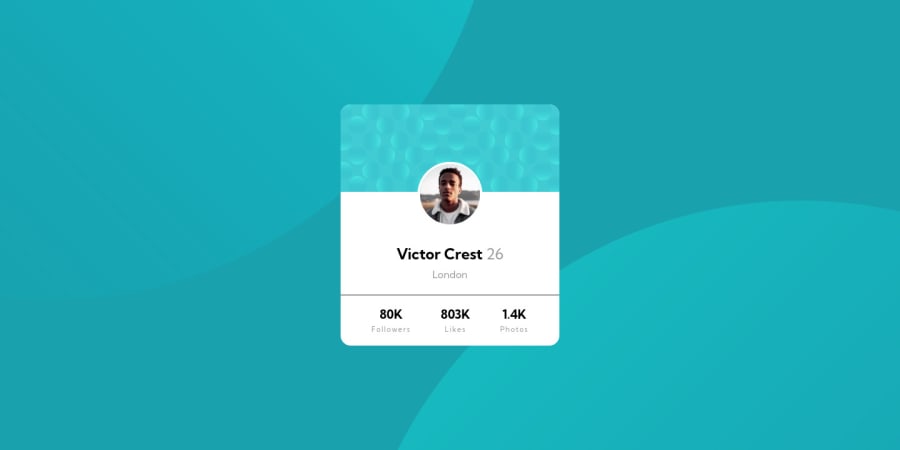
Responsive Profile card component created with CSS Flexbox
Design comparison
Solution retrospective
Hii everyone, this is the eighth challenge I have tried to recreate. I'm so happy about how it turned out, but I think I could further improve in writing cleaner code.
It would be helpful for my future growth if you could point me in the right direction. For example, I'm interested in potentially better solutions for this challenge. In which area do I need to improve, and what do you recommend that I should implement? What are some best practices that I haven't got right?
In this challenge, I had lots of problems with background positioning. I have to research some better alternatives to my solution. Maybe there is a better way to position those two bubbles?
Thanks for your attention and all the future feedback.
Community feedback
Please log in to post a comment
Log in with GitHubJoin our Discord community
Join thousands of Frontend Mentor community members taking the challenges, sharing resources, helping each other, and chatting about all things front-end!
Join our Discord
