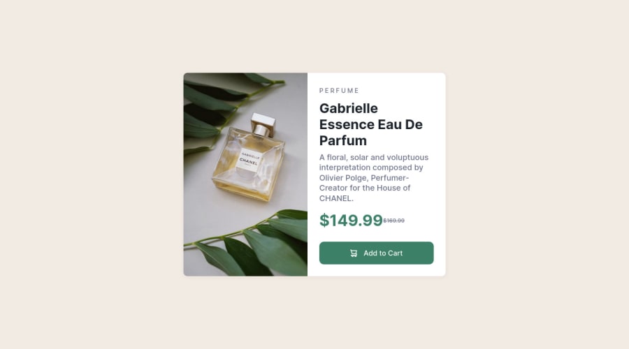
Responsive -product-preview-component
Design comparison
Solution retrospective
Hello guys it has been months now since I refrained from coding due to my final exams. Now I have to learn a lot of things that I have forgotten. Please kindly review my work and suggest some ways that can help me improve. I really appreciate you all.
Community feedback
- @MelvinAguilarPosted over 2 years ago
Hi @Kamasah-Dickson, I really like your solution! 👋
I have been reading about how to use SASS with the BEM naming convention. I have a suggestion that could help. I also see that you have experience in web design, so it's a humble opinion.
It seems to me that SASS provides a lot of power. However, nesting many selectors could be detrimental if you want to identify which selector is more specific when setting styles.
For example, if I want to update the font size of your header in ".price" with a media query, due to the specificity of <h2>, this selector would be the most specific:
.card .card_img img .card_details .pricing .price h2 {
	font-size: 2rem;
}
With BEM example:
.card { &__price h2 { font-size: 2rem; } }It is an opinion. If you wish, I can delete the comment sorry for my English
I hope this helps you
Marked as helpful0@Kamasah-DicksonPosted over 2 years ago@MelvinAguilar I really appreciate your opinion well I forgot about using BEM for components like this. Thanks @MelvinAguilar
0 - @VCaramesPosted over 2 years ago
Hey @Kamasah-Dickson, some suggestions to improve you code:
- For this challenge you want to use the Picture Element not the Background Image Property. The Background Image Property is mainly used on decorative images NOT images that add value and serve a purpose.
Picture Element will allow your to switch between images in different breakpoints and makes your site load faster by saving bandwidth.
Syntax:
  <picture>
    <source media="(min-width: )" srcset="">
    <img src="" alt="">
  </picture>
Source:
https://www.w3schools.com/html/html_images_picture.asp
https://web.dev/learn/design/picture-element/
-
Once you fix the image implementation, you'll want to include an Alt text tag with them. Inside that Alt Tag you want to describe what the image is; they need to be readable. Assume you’re describing the image/icon to someone.
-
There is only one heading in this challenge and that is the name of the perfume, “Gabrielle Essence Eau De Parfum”.
-
The old price is not being announced properly to screen readers. You want to wrap it in a Del Element and include a sr-only text explaining that this is the old price.
-
The "shopping cart" icon is decorative, so its Alt Tag* should left blank and have an aria-hidden=“true” to hides it from assistive technology.
Happy Coding!
Marked as helpful0@Kamasah-DicksonPosted over 2 years ago@vcarames Thanks for your comment it is really helpful
0
Please log in to post a comment
Log in with GitHubJoin our Discord community
Join thousands of Frontend Mentor community members taking the challenges, sharing resources, helping each other, and chatting about all things front-end!
Join our Discord
