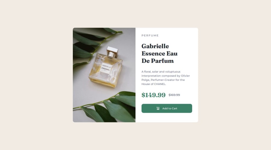
Design comparison
SolutionDesign
Please log in to post a comment
Log in with GitHubCommunity feedback
- @sivaprasath2004
Hello sivaoptr i will wishing for your solution.
- Your solution was big size and you will be use padding is more big please change the code make sure it very perfect and design was so closer and it more efficient.
.details_container { width: 50%; padding: 2rem; }- change the code
.details_container { width: 50%; padding: 1.5rem; }Marked as helpful - @Yazeed-git
Your solution looks great 👌, and there's a couple of lines I could learn from your code.
For feedback, the only element to adjust would be the title(h1); 'Gabrielle Essence Eau De Parfum', the line-height should be less as the text is big and bold and requires less vertical spacing. Cheers
Marked as helpful
Join our Discord community
Join thousands of Frontend Mentor community members taking the challenges, sharing resources, helping each other, and chatting about all things front-end!
Join our Discord
