

Design comparison

Solution retrospective
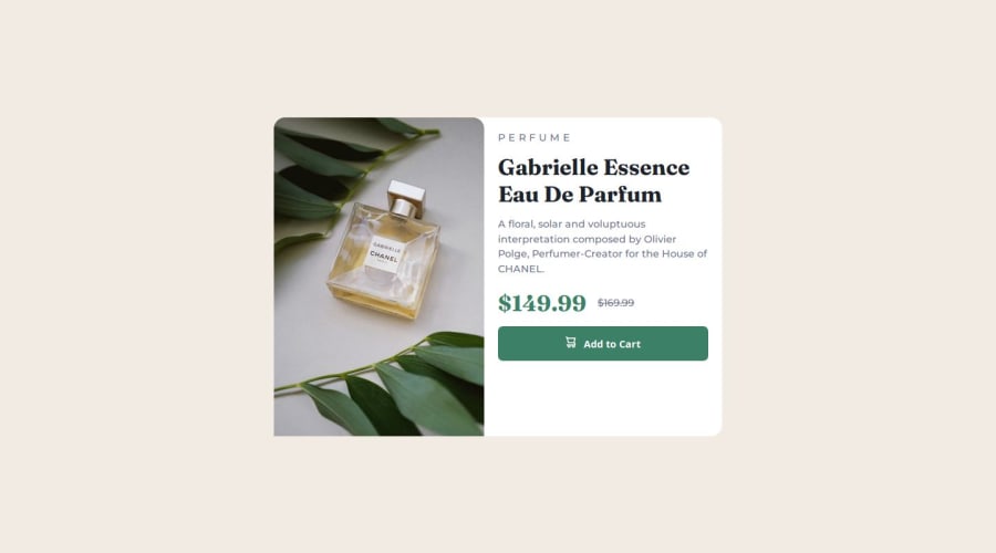
im proud that its my first time i used a mobile first design approach and worked on responsiveness, i would definitely look more into different aspects of responsive design and how to refactor my code so the layout is responsive on all screen sizes
What challenges did you encounter, and how did you overcome them?i found it hard from making my card component go from the mobile scree size to the desired design on desktop and all the screen sizes in between
What specific areas of your project would you like help with?i need help on wondering how to make my image responsive as on a tablet size it is not clear and on the large laptop size, my content seems to get smaller and all up in the container which isnt the desired design. it looks good on the small laptop screen size though around the 1000px mark.
Community feedback
Please log in to post a comment
Log in with GitHub
Join our Discord community
Join thousands of Frontend Mentor community members taking the challenges, sharing resources, helping each other, and chatting about all things front-end!
Join our Discord