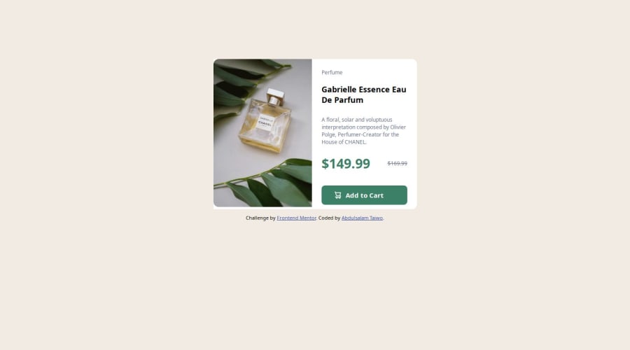
Design comparison
SolutionDesign
Solution retrospective
What are you most proud of, and what would you do differently next time?
I’m able to make my website responsive on both desktop site and mobile size.
What challenges did you encounter, and how did you overcome them?Trying to make an image not to display on mobile site. But I figured it.
What specific areas of your project would you like help with?I’m always unable to install font.
Community feedback
- @CarlosFabianGPosted 5 months ago
I recommend you to double check paddings to make your solution closer to the design. About the fonts it is only a matter of pasting the code on googlefonts in your html. Check a youtube tutorial on how to do it. Other than that, great effort. Keep practicing.
0
Please log in to post a comment
Log in with GitHubJoin our Discord community
Join thousands of Frontend Mentor community members taking the challenges, sharing resources, helping each other, and chatting about all things front-end!
Join our Discord
