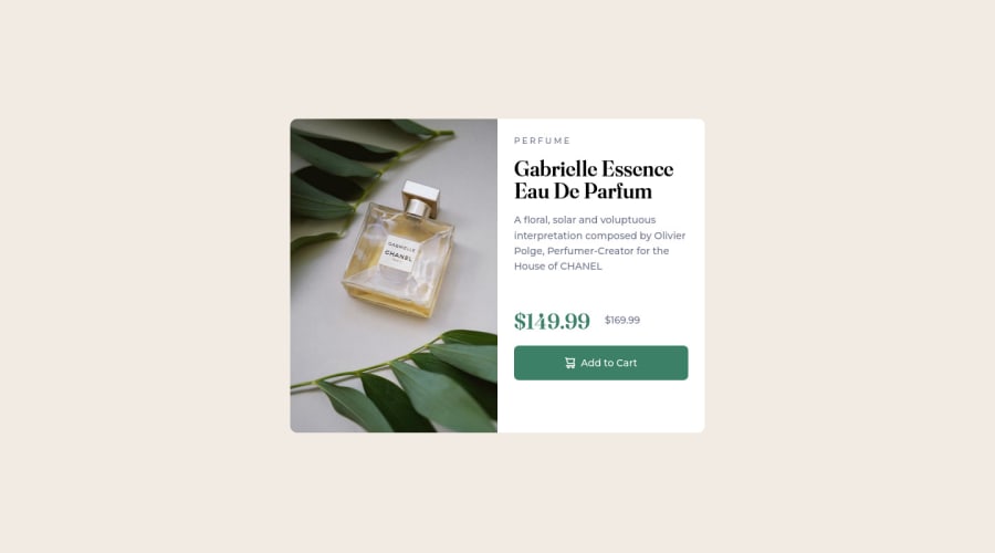
Responsive product preview using flexbox and media queries.
Design comparison
Solution retrospective
Would there be a better way to deal with the images than the one I used?
Community feedback
- @elaineleungPosted over 2 years ago
Hi Mohieb, I think you did a great job here! About your question, I think using
pictureis a doable way, certainly much better than usingdisplay: noneto toggle between the mobile and desktop views, and I've also usedpicturemany times as well for just switching between different sized images. Having said that,pictureis more appropriate for switching different types of media, not just for size switching. If it's just for size switching as in this case, you can try just using animglike this withsrcset(which is also used inpicture):<img alt="CHANEL perfume bottle" srcset="image-product-desktop.jpg 600w, image-product-mobile.jpg 686w" sizes="(min-width: 573px) 600px, 686px" src="image-product-mobile.jpg">Hope this answers your question, and once again, great job!
Marked as helpful0
Please log in to post a comment
Log in with GitHubJoin our Discord community
Join thousands of Frontend Mentor community members taking the challenges, sharing resources, helping each other, and chatting about all things front-end!
Join our Discord
