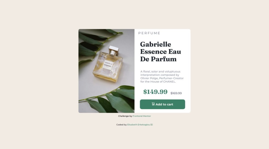
Design comparison
Solution retrospective
Hello hackers, here is my solution to the project. What do you think ? Is the page full responsive to you ? I tried my best, but I am still insecure if the page is full responsive. I still have an issue with the tittle. It is not seeming to fit like on the image. What do you suggest ? Thanks in advance, Elisabeth
Community feedback
- @mikeFreesPosted over 1 year ago
Hi! Your solution looks great. I am still learning myself but i tried to help you with your title.
this seems to work. adding this to your css file .product-title { padding-left: 10%; text-align: left; }
and i changed this in your HTML file
<h1 class="product-title"> Gabrielle Essence Eau De Parfum</h1>it had 2 <br> elements in there that did not seem nesecary.
Great work & Happy Coding!
Marked as helpful0@elic4vetPosted over 1 year ago@mikeFrees Hello Mike, thanks a lot for your prompt answer. I haven't thought at all about the padding ! Thanks for debugging me :)
1 - @asbhogalPosted over 1 year ago
Hi Elisabeth, good work! Just a few extra things:
- Make sure to locally host your Google Fonts for privacy and performance. Here's a good tutorial from Kevin Powell about it: https://www.youtube.com/watch?v=zK-yy6C2Nck
- I'd reduce the
@mediaquery width to something closer to650pxas the content can accommodate up until then - Avoid setting a
heightvalue to the body, as this can cause positioning issues (the content in the child containers should occupy their own space naturally), as well as amarginvalue, as this is causingoverflow(noticed you had this set to hidden to hide this.)
Hope this helps!
0
Please log in to post a comment
Log in with GitHubJoin our Discord community
Join thousands of Frontend Mentor community members taking the challenges, sharing resources, helping each other, and chatting about all things front-end!
Join our Discord
