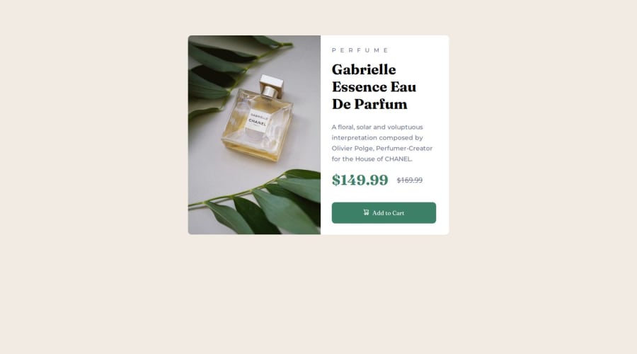
@huyphan2210
Posted
Hi @YourRat-webdev,
I checked out your solution and had a few observations:
- The card isn’t centered in the viewport because the
body
doesn’t stretch to fill the height. By default, thebody
only takes up as much height as its content, which prevents vertical centering. You can fix this by addingmin-height: 100vh
, ensuring that the body always fills at least the entire height of the viewport. This way, even if there’s little content, the card can be centered vertically. Additionally, remove themargin-top: 1rem
on thebody
to avoid any vertical overflow that might push the content down and disrupt the layout. - I noticed you’re using a media query for viewports 30.85rem (493.6px) wide and above. The card exceeds the viewport width on mobile devices between 493.6px and 589px, causing horizontal scrolling since the card is 590px wide. This might not be the best user experience.
- Regarding responsive design, media queries aren’t the only approach. Also, it’s important to be deliberate about the viewport widths you choose. Why 30.85rem specifically? There are many great resources on responsive design to explore.
Hope this helps!
Marked as helpful