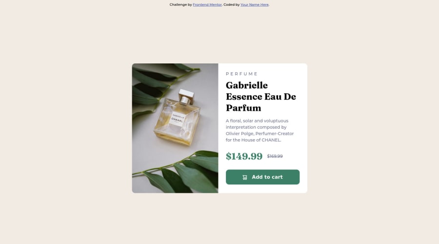
Design comparison
Solution retrospective
Hi there! I have to say i struggled a lot with this one when i had to manage flex-items sizes. Please give me your feedback and if you know another preetier solution i will thank you a lot
Community feedback
- @MoggStephenPosted over 1 year ago
Hi there!
Overall nice component.
To fix your sizing issue, you have a max-width of 95% set on your mobile version in .card. You should measure the size of the container in designs and set the max-width to that amount. If you set a width of 100% at the same time the container should be nice and responsive.
For this component there are desktop and mobile versions of the image that should be switched between at your breakpoints.
Your method of centering the component in your media query can be used for your mobile version too! For small components I think this method is fine, but typically centering elements is done with flex and justify-content-center/align-items-center especially in larger projects and challenges.
Other than that you matched the designs pretty well!
0
Please log in to post a comment
Log in with GitHubJoin our Discord community
Join thousands of Frontend Mentor community members taking the challenges, sharing resources, helping each other, and chatting about all things front-end!
Join our Discord