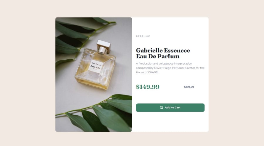
Responsive Product Preview Component - CSS Grid, Flexbox, Mobile First
Design comparison
Solution retrospective
I did an entire mobile first approach trying to ensure everything was consistent and focused on accessibility aswell as a responsive layout.
I also focused on the CSS to make sure it was structured and appropriate
What challenges did you encounter, and how did you overcome them?None - my biggest area I ran into was a bug with the scaling of my layout but it was a typo that caused it
What specific areas of your project would you like help with?Responsiveness & Accessibility Best practice guidance where possible as I am always wanting to improve
Community feedback
- @grace-snowPosted 6 months ago
I hope this is helpful
- you should be using the picture element to serve the main card images. The mobile as the default and the large screen one in the source tag with a min-width media query. This is much better for performance.
- the alt text should describe distinctive features of the image. There is no benefit to it if it just repeats the product name that's in the heading anyway.
- don't capitalise text in html. Let css do that. Its a styling comcern not a content concern.
- this kind of product card would never be used to serve the main heading on a page. So you know it shouldn't have a h1. Use a lower importance heading level like h2 instead.
- strike through text isn't consistently announced to screen readers. I recommend you include some sr-only text in a span to make it clear that is the old price.
- there are extra divs inside the text area of the card that seem unnecessary. I'm not sure why the price one includes the button or why theres one wrapping the heading and paragraph. Or why theres an extra span wrapping the button icon.
- I would expect this card to have two divs inside. One for the image (picture element) and one for the text content. Making the image itself into the flex/grid child isn't as robust. Think of it as one set of elements for the layout, then the image or text are the content that gets placed into that layout. If an author ever swaps out that content for some new content, nothing should break. It's a general principle to consider rather than a "failure" - the best practice would be to place the image inside the component layout not make it be part of the layout. I hope that explains it.
- you don't need all those css custom properties for font families on each element. That's not at all how you should be using variables like this. Just set the font family on the body. That's what's used for most elements and they will inherit from the body. Then set it for headings as base styles (or on the class for the heading). In a real project, sensible base styles are usually set on element selectors straight after the reset. At the most yoh need two css custom properties for font family: heading and body.
- not for this challenge, just general learning: Custom properties are for values that will be reused a lot. And often custom property values themselves will change. That's where there value really comes — like setting a --heading-color property might be set to two different colour values depending on whether it's inside a dark theme or light theme selector.
- either the body or main need a min-height 100svh.
- I'm not sure why both body and main are flex columns... That seems unusual, possibly unnecessary (note I am only reading the code not at my computer so unable to inspect which may make the reason clearer).
- I would expect the main to have padding not margin. It's not wrong but is an unusual choice. If the purpose is to prevent its content from hitting its edges it should be padding.
- border radius can go on the card with overflow hidden to crop out the overflowing child corners. There's no need to set border radius on the card components child elements which then have to change at each screen size. More work for no benefit.
- the text part of the card should have padding on all sides. Don't over complicate it.
- it's fine to use flex for this component, but it would be shorter/easier to use grid. Because by default (mobile) grid stacks vertically, then the only change needed on larger screens is defining two template columns of 1fr.
- for the pricing part it would make more sense to use flex there (as the layout only needs to be along one axis) and include flex-wrap for the rare occasions where large text sizes/small devices may cause the content to need to wrap. The button doesn't need to be in that container. It's just a full width button, separate content. Adding it into the price container is over complicating.
- don't set border none on buttons. Leave at least a transparent border (or the same colour as the background). High contrast themes rely on buttons having borders to be able to style them correctly (accessibility issue).
- of the button is flex use the gap property on it don't set directional margins to create space between it's children. Eg gap: 1ch.
- the text side of the card doesn't need different styling between mobile and desktop. It looks like only the padding needs to change a little.
Marked as helpful1
Please log in to post a comment
Log in with GitHubJoin our Discord community
Join thousands of Frontend Mentor community members taking the challenges, sharing resources, helping each other, and chatting about all things front-end!
Join our Discord
