

Design comparison
SolutionDesign

Solution retrospective
What are you most proud of, and what would you do differently next time?
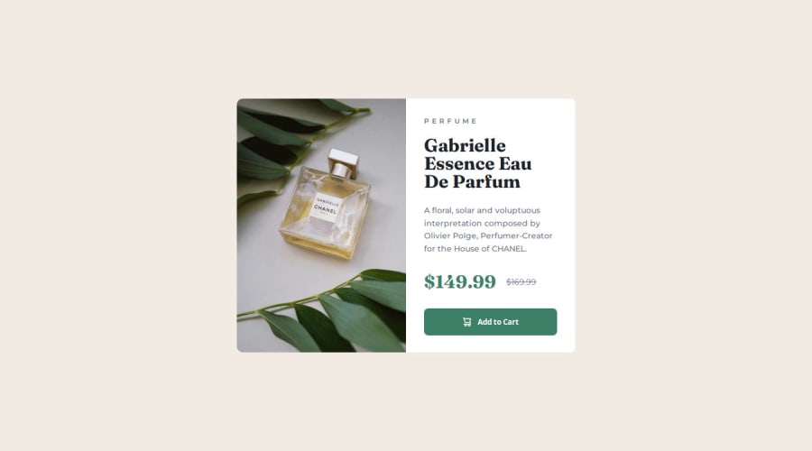
I’m most proud of the clean and responsive layout, especially how the design adapts seamlessly between mobile and desktop views. The use of Flexbox made structuring the card straightforward, and the CSS variables kept styling consistent.
Next time, I’d work on optimizing performance by reducing unnecessary styles and improving reusability with utility classes. I’d also explore alternative layout techniques to see if there’s a more efficient approach.
Community feedback
Please log in to post a comment
Log in with GitHubJoin our Discord community
Join thousands of Frontend Mentor community members taking the challenges, sharing resources, helping each other, and chatting about all things front-end!
Join our Discord