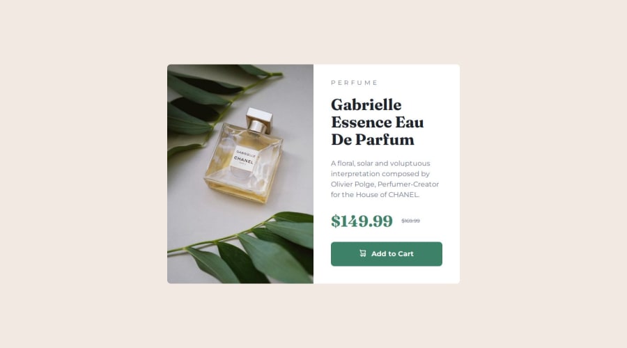
Responsive product preview card with React and Tailwind CSS
Design comparison
Solution retrospective
This is my first time using React and Tailwind CSS to build a webpage. Next time, I might try to simplify my Tailwind code or make it more structured.
What challenges did you encounter, and how did you overcome them?Writing CSS with React components was a bit confusing at first, but with Tailwind CSS, everything can suddenly look great once you get used to it.
What specific areas of your project would you like help with?It still takes me some time to complete the challenge at this moment. If there is any feedback on the redundant parts of my code, I would greatly appreciate it.
Community feedback
- @MehmetAydar01Posted 5 months ago
Absolutely perfect project 👏 You can use these css properties for your main element. Instead: <main className='h-screen flex'>, you can use: <main className='h-screen flex items-center justify-center'>. So, there is no need to give m-auto to the top element in your Card.jsx file. Enjoy the work
Marked as helpful0P@KoalaChangPosted 5 months ago@MehmetAydar01 thank you very much! I have revised my code and it works totally fine
1
Please log in to post a comment
Log in with GitHubJoin our Discord community
Join thousands of Frontend Mentor community members taking the challenges, sharing resources, helping each other, and chatting about all things front-end!
Join our Discord
