Submitted over 1 year ago
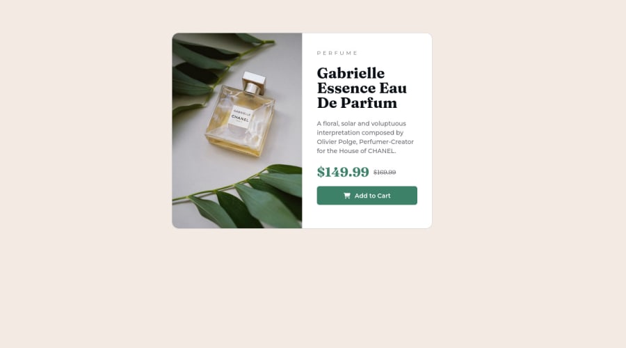
Responsive product preview card with html & css & bootstrap 5
@hsyigitoglu
Design comparison
SolutionDesign
Solution retrospective
I'm waiting feedbacks from you
Community feedback
- @frank-itachiPosted over 1 year ago
Hello there 👋. Congratulation for completing the challenge👍!
I have some suggestions about your code that might interest you.
HTML 📄:
- Wrap the page's whole main content in the
<main>tag. - Since the mobile design has a different image, you can use the
<picture>tag that allows you to interchange the images depending of the viewport size. Red more about this awesome tag here. - Make sure that the
<img>elements in your HTML code has an alternate (descriptive) short text. The reason for this is that screen readers can’t translate images into text. So to fix this you can do the following<img src=”…” alt=”short text” >
CSS 🎨:
- You can use grid or flexbox to center the content no matter the viewport size. Using Grid:
body {
	min-height: 100vh;
        display: grid;
	place-content : center;
}
FlexBox
body { min-height: 100vh; display: flex; align-items: center; justify-content: center; }- You can also use the
text-transform: uppercase;property to make the perfume word appear in upper case even though you typed it in lower case in the HTML file.
I hope you find it useful! 😄 Above all, you did a good job!
Happy
<coding />😎!Marked as helpful1 - Wrap the page's whole main content in the
Please log in to post a comment
Log in with GitHubJoin our Discord community
Join thousands of Frontend Mentor community members taking the challenges, sharing resources, helping each other, and chatting about all things front-end!
Join our Discord
