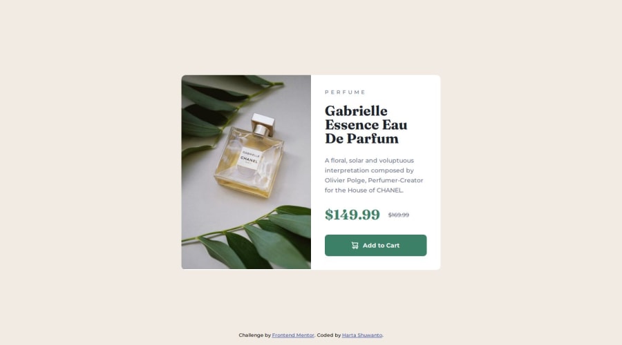
Responsive product preview card with mobile-first workflow and BEM


Design comparison

Solution retrospective
On the progress to getting used to BEM naming convention. Using BEM in every challange and also the mobile-first workflow.
What challenges did you encounter, and how did you overcome them?Switching images between desktop-view and mobile-view.
Solution: Using display: none and display: block to switch from each other. At first, I use content: url() property, but seems like it didn't work. The image just didn't show up on remote (in the github), but could show up locally.
Solution (updated): Using picture tag.
What specific areas of your project would you like help with?Thanks to @KapteynUniverse for sharing such a valuable input.
Need to learn more about:
- Semantics HTML in depth.
- Make an efficient, modular, maintainable CSS code to work with a team.
- BEM naming convention
Community feedback
- @KapteynUniversePosted 5 months ago
Picture tag is what you need.
Also <div> tag is used as a container for HTML elements, i recommend you to use p tag for the long text and maybe another p with span inside for the prices. You can also dive deeper and add some screen reader only texts like old price, discount, new price etc.
Marked as helpful1P@hartashuPosted 5 months ago@KapteynUniverse Wow cool! Thanks for the advice. I will try the picture tag and also change the div tag with p tag.
At first, I used p tag for every text in html except the heading part. But lately, I change my mind. For every short text, I use div. Is div tag only used as container? Or is there any condition where we have to use div beside as a container? And also for the "PERFUME" part, what do you think to use, p or div tag?
0@KapteynUniversePosted 5 months ago@hartashu Div should be used only when no other semantic element is appropriate (There is article, nav, section, hgroup, lists etc.) and to contain group of elements. There may be times to contain only one element for styling purposes ofc, like
<div>
  <p>
    ...
  </p>
</div>
For texts there are lots of tags, p, headings, q for small quotes, another quotes tag blockquote, time, abbr for abbreviation/acronym etc.
You can check here for every tag
"PERFUME" part is called ribbon text in the design world. P tag would be better.
For this challenge Grace Snow has a article
You can also check Kevin Powells video
Marked as helpful1P@hartashuPosted 5 months ago@KapteynUniverse Okay. Thanks a lot for such a lot of good helpful input 👍
1

Please log in to post a comment
Log in with GitHub
Join our Discord community
Join thousands of Frontend Mentor community members taking the challenges, sharing resources, helping each other, and chatting about all things front-end!
Join our Discord