Submitted about 2 years ago
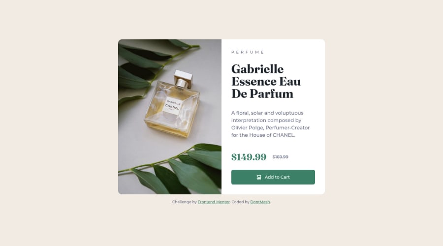
Responsive product preview card using Svelte + Tailwind
@DontMash
Design comparison
SolutionDesign
Community feedback
- @jamesbarnettPosted 4 months ago
Hi,
Very nice work on your solution! It looks excellent.
Things I especially liked:
- Use of Tailwind, Vite, and Svelte.
- Very nice responsiveness from tiny to giant screens.
- Fantastic work on the typography!
- The way you utilized tailwind
screens to make things responsive without media queries.
Things that could be improved:
- The W3's guidance is to use
rems over pixels for font sizes is better for accessibility and future proofing. https://www.w3.org/WAI/tutorials/page-structure/styling/
Happy coding!
0
Please log in to post a comment
Log in with GitHubJoin our Discord community
Join thousands of Frontend Mentor community members taking the challenges, sharing resources, helping each other, and chatting about all things front-end!
Join our Discord
