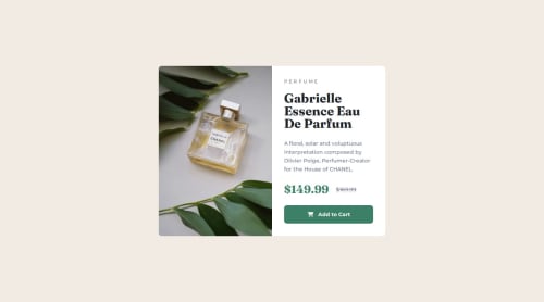
Responsive product preview card using tailwindcss

Solution retrospective
I'm proud of learning how to use the <picture> element and to install fontawesome via npm.
Next time I would try to find an icon that better matches the design and that way explore other icon libraries.
What challenges did you encounter, and how did you overcome them?-
I didn't know how to have the image change src according to breakpoints. Tried using srcset on the <img> element but failed. Then watched some youtube videos about the <picture> element and that worked.
-
On the desktop breakpoint the image and the content had to occupy the same space of the card but I couldn't get the image to not become deformed. I overcame this by tayloring the size of the card to the proportions of the image.
-
Also struggled to install fontawesome. Turns out I had to move the "webfonts" folder from node_modules to the root directory.
-
What icon libraries would you recommend?
-
When it comes to hover states should I have a media query so that they are not applied on the mobile breakpoint? For example, "md:hover:bg-red-500" as opposed to just "hover:bg-red-500". Or is it irrelevant?
-
Feedback on any other aspect of the project you see fit is much appreciated.
Please log in to post a comment
Log in with GitHubCommunity feedback
No feedback yet. Be the first to give feedback on NunoJDMachado's solution.
Join our Discord community
Join thousands of Frontend Mentor community members taking the challenges, sharing resources, helping each other, and chatting about all things front-end!
Join our Discord