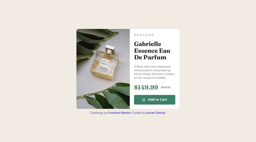
Responsive Product Preview Card using SASS


Design comparison

Solution retrospective
I am really pleased with the responsiveness using grid and media queries for the layout. My first time applying SASS to a project so it took me much longer to complete this. Also first time doing a mobile-first design so having to think backwards was challenging. I was going to use a pseudo element (::after) for the "old price" but I realised this was not good for accessibility.
I had difficulties getting my head around using breakpoints, using clamp() for responsive fonts and width: min() for responsive layout. Did a lot of trial and error before finding the sweet spots. Also the architecture of SASS was a bit confusing at first, knowing how to structure the folders. I can see now how this makes it easier to work on a project.
Also getting the image to change from mobile to desktop took me a while, looking at StackOverflow I realised I could include both images in the HTML, using display: none or display: block at the right breakpoints allowed me to hide and show the relevant image.
I could probably structure the SASS folders better next time, it's new to me so it's a learning process at this point. Any feedback on whether I could have done anything differently to make the code simpler would be appreciated.
Community feedback
- @AdrianoEscarabotePosted 5 months ago
Hi Lauren Delmar, how are you doing? I really loved the outcome of your project, but I have a few suggestions that I think might be helpful:
Use the THE PICTURE TAG that is a shortcut to deal with the multiple images in this challenge. So you can use the
<picture>tag instead of importing this as an<img>or using a div withbackground-image. Use it to place the images and make the change between mobile and desktop, instead of using adivorimgand set the change in the css withdisplay: nonewith the tag picture is more practical and easy. Note that for SEO / search engine reasons isn’t a better practice import this product image with CSS since this will make it harder to the image. Manage both images inside the<picture>tag and use the html to code to set when the images should change setting the devicemax-widthdepending of the device desktop + mobile.Check the link for the official documentation for <picture> in W3 SCHOOLS: https://www.w3schools.com/tags/tag_picture.asp
See the example below:
<picture>
  <source media="(max-width:650px)" srcset="./images/image-product-mobile.jpg">
  <img src="./images/image-product-desktop.jpg" alt="Gabrielle Parfum" style="width:auto;">
</picture>
The rest is excellent.
I hope you find it useful. 👍
Marked as helpful1 - @dylan-dot-cPosted 5 months ago
Well done! This is a great solution.
One thing you can do differently is to use the
picturetag/element to easily switch between pictures by using the media attribute to specify what ranges this img should show on. I suggest you search it up and see how it can be used.Also for
item-pricingyou can use flex instead of grid just for less code and complexity.Marked as helpful1


Please log in to post a comment
Log in with GitHub
Join our Discord community
Join thousands of Frontend Mentor community members taking the challenges, sharing resources, helping each other, and chatting about all things front-end!
Join our Discord