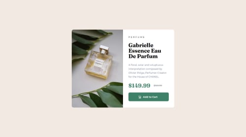
Responsive Product Preview Card using Sass

Solution retrospective
I am most proud of using the picture element to responsively change the image depending on page size. This was the first time I have used it, it seems a more efficent way of dealing with responsive pages that require multiple images.
<picture>
          <source srcset="./images/image-product-desktop.jpg" media="(min-width:610px)" />
          <source srcset="./images/image-product-mobile.jpg" />
          <img src="./images/image-product-mobile.jpg" alt="Product image" />
</picture>
Next time I will give better class names to my code.
What challenges did you encounter, and how did you overcome them?I found getting the images to fit the container to be the most difficult. Eventually I found object-fit which helped solved the issue. Will need to look more into styling images in the future
What specific areas of your project would you like help with?Did I use the picture element correctly?
Also is the scss structure correct?
Any suggestions on improving code?
Please log in to post a comment
Log in with GitHubCommunity feedback
No feedback yet. Be the first to give feedback on Kumani Kidd's solution.
Join our Discord community
Join thousands of Frontend Mentor community members taking the challenges, sharing resources, helping each other, and chatting about all things front-end!
Join our Discord