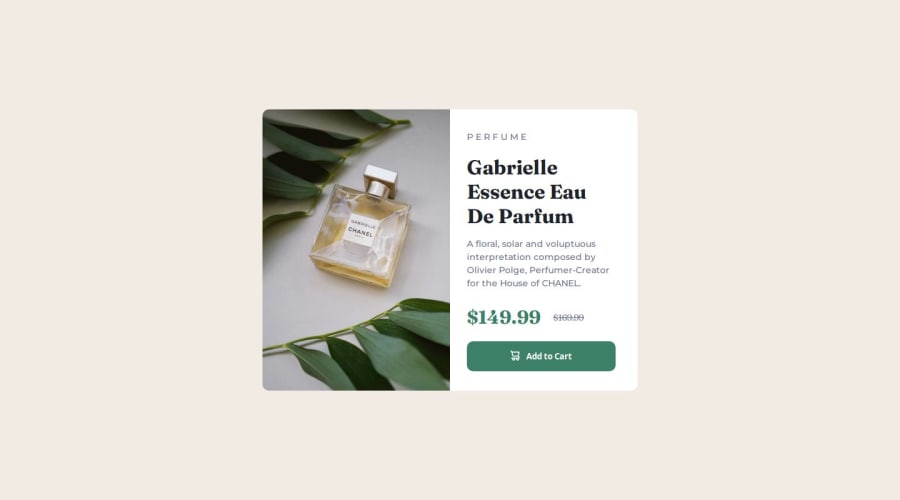
Responsive Product Preview Card Using Media Queries


Design comparison

Solution retrospective
I am most proud of being determined enough to complete the project.
What challenges did you encounter, and how did you overcome them?The challenges I encountered had mostly to do with the media queries. My understanding of how they work and what I had to do to make it work are two different things. I overcame this by just playing around with it until it looked correct.
What specific areas of your project would you like help with?The specific area of my project that I would like help with is media queries. I thought that you always use max-width, but I was unable to make my project look correct using just that. I had to use min-width as well.
Please log in to post a comment
Log in with GitHubCommunity feedback
- @KapteynUniverse
Hey Erika, nice job.
I have never heard that you should always use media queries with max-width, but I think using min-width is better. I guess it is a choice about choosing between starting with mobile or desktop layout.

Join our Discord community
Join thousands of Frontend Mentor community members taking the challenges, sharing resources, helping each other, and chatting about all things front-end!
Join our Discord