Submitted 5 months ago
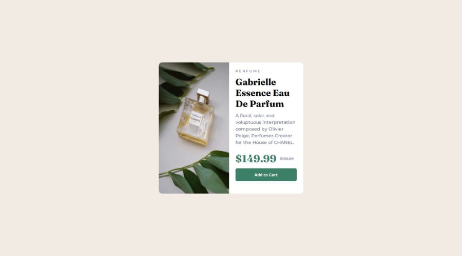
Responsive Product Preview Card Using HTML, CSS, CSS GRID AND FLEXBOX
@AlienInvade
Design comparison
SolutionDesign
Solution retrospective
What are you most proud of, and what would you do differently next time?
N/a
What challenges did you encounter, and how did you overcome them?N/A
What specific areas of your project would you like help with?N/A
Community feedback
- @danielmrz-devPosted 5 months ago
Hello there!
Congrats on completing the challenge! ✅
Your project looks great!
I have a suggestion about your code that might interest you:
📌 You can use the
<picture>tag when you have different versions of the same image.Using the
<picture>tag will help load the correct image to the user's device, saving bandwidth and improving performance.Example:
<picture>
    <source media="(min-width: 768px)" srcset="{desktop image path here}">
    <img src="{mobile image path here}" alt="{alternative text here}">
</picture>
I hope this helps!
Other than that, excellent work!
1
Please log in to post a comment
Log in with GitHubJoin our Discord community
Join thousands of Frontend Mentor community members taking the challenges, sharing resources, helping each other, and chatting about all things front-end!
Join our Discord
