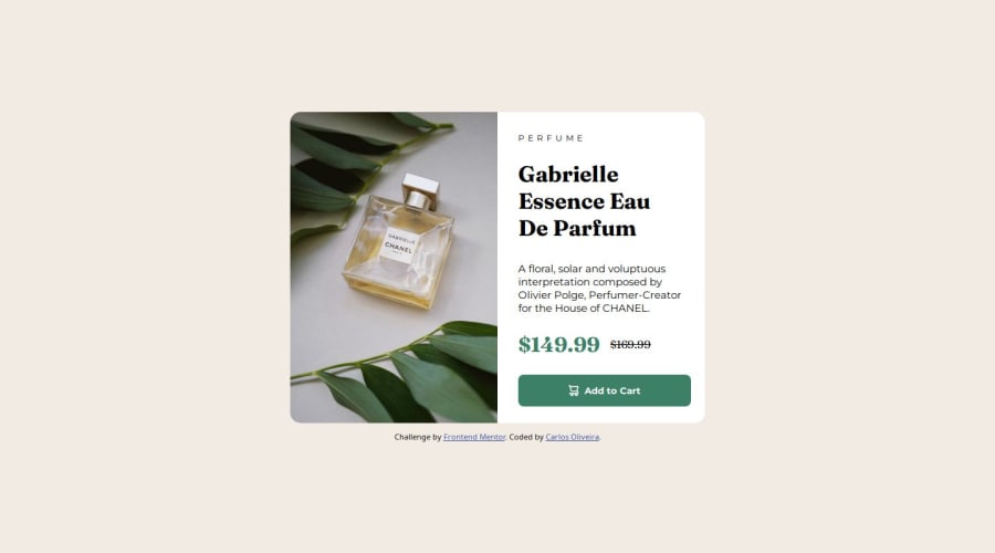
Responsive product preview card using HTML and CSS with flexbox
Design comparison
Solution retrospective
I'm feeling more comfortable with the platform.
What challenges did you encounter, and how did you overcome them?I had diffitculty to import the fonts directly but i did some search and found the solution.
Community feedback
- @DylandeBruijnPosted 4 months ago
@carlos-henriquee
Hiya! 👋
Congratulations on your solution, it looks very close to the design! I can tell you put a lot of effort into it.
Things you could improve ✍️
-
I suggest adding a bit of
paddingto yourbodyelement so the card has some space around it on smaller viewports. -
I suggest using clear descriptive CSS classes like
.card,.card-titleand.card-description. -
Try using semantic HTML elements like
main,sectionandarticle. -
Try using using relative CSS units like
remandemthey make your layout more adaptable. -
Try styling your elements using classes instead of ID’s. Most of the time they are the better choice. ID’s are mostly used to select elements using JavaScript, navigation on the page itself and to style unique elements.
-
Try using the
pictureelement to achieve responsive images. -
On smaller viewports your solution could be more responsive.
I hope you find my feedback helpful! 🌟
Let me know if you have more questions and I'll do my best to answer them. 🙋♂️
Happy coding! 😎
Marked as helpful1@carlos-henriqueePosted 4 months ago@DylandeBruijn
Hi, Dylan 😁
Thank you so much for the feedback! Your tips will be very helpful, i promise that i'll make an effort to improve my code and skills.
Happy coding! 🚀
1 -
Please log in to post a comment
Log in with GitHubJoin our Discord community
Join thousands of Frontend Mentor community members taking the challenges, sharing resources, helping each other, and chatting about all things front-end!
Join our Discord
