Not Found
Not Found
Not Found
Not Found
Not Found
Not Found
Not Found
Not Found
Not Found
Not Found
Not Found
Not Found
Not Found
Not Found
Not Found
Not Found
Not Found
Not Found
Not Found
Not Found

Submitted

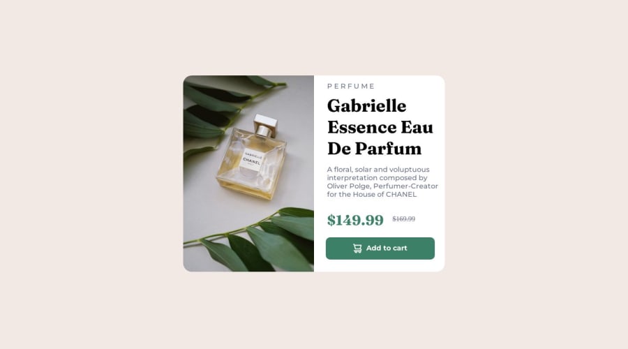
Responsive product preview card using HTML and CSS (media and flexbox)

Paulo Xavierβ€’ 100

@paulo-xavier

Desktop design screenshot for the Product preview card component coding challenge

This is a solution for...

  • HTML
  • CSS
1newbie
View challenge

Design comparison


SolutionDesign

Solution retrospective


What did you find difficult while building the project? The most difficult part for me was create a responsive layout for both mobile/desktop. That's my second time using media. I decided to use media because it's a good resource for reponsive layouts and because I've done it one time before.

Which areas of your code are you unsure of? I'm sure about all the parts of my code, although I'd like to know which aspects of my code I could improve, in terms of clean code and best practices.

Community feedback

@MelvinAguilar

Posted

Hello there πŸ‘‹. Good job on completing the challenge !

Overall, the solution is well done. I can only give you a few small tips to consider in this challenge.

  • Keep font size in relative units like em or rem, not vh (viewport height). Using vh for font size may cause inconsistent scaling on different screen sizes
  • Avoid using many nested selectors (e.g.: main .section2 .perfume-description) in your CSS to maintain code simplicity, readability, and prevent specificity issues. Simply use: .perfume-description
  • You can shorten the border-radius declaration using shorthand notation:
Your actual code:
β€Ž β€Ž β€Ž border-radius: 30px;
β€Ž β€Ž β€Ž border-bottom-right-radius: 0;
β€Ž  β€Ž β€Žbβ€Žorder-bottom-left-radius: 0;

You can shorten it as follows:
β€Ž β€Ž β€Ž border-radius: 30px 30px 0 0;

β€Ž Format: border-radius: [top-left] [top-right] [bottom-right] [bottom-left];

  • Consider using a <button> element instead of a <div> with class "buttom". If an element has a pointer cursor and a hover effect, it indicates interactivity, commonly used for buttons, links, form fields, etc..
  • Utilize header elements (e.g., <h1>, <h2>, etc.) to provide a hierarchical structure to your content, making it more accessible and helping search engines understand your page's organization.
  • There's no need to enclose each element in a <div> unless it serves a specific purpose for styling or layout.

For more in-depth knowledge about semantic elements and HTML planning, you can read the article "How to plan your HTML: Product Preview Card" at https://fedmentor.dev/posts/html-plan-product-preview/.

Overall, the solution is very well executed. Good luck with your future coding endeavors

Happy coding!

Marked as helpful

1

Paulo Xavierβ€’ 100

@paulo-xavier

Posted

@MelvinAguilar Thanks very much for the useful tips!! I will apply this concepts in my future projects! Have a good week! 😁 Happy coding!

0

Please log in to post a comment

Log in with GitHub
Discord logo

Join our Discord community

Join thousands of Frontend Mentor community members taking the challenges, sharing resources, helping each other, and chatting about all things front-end!

Join our Discord