

Design comparison

Solution retrospective
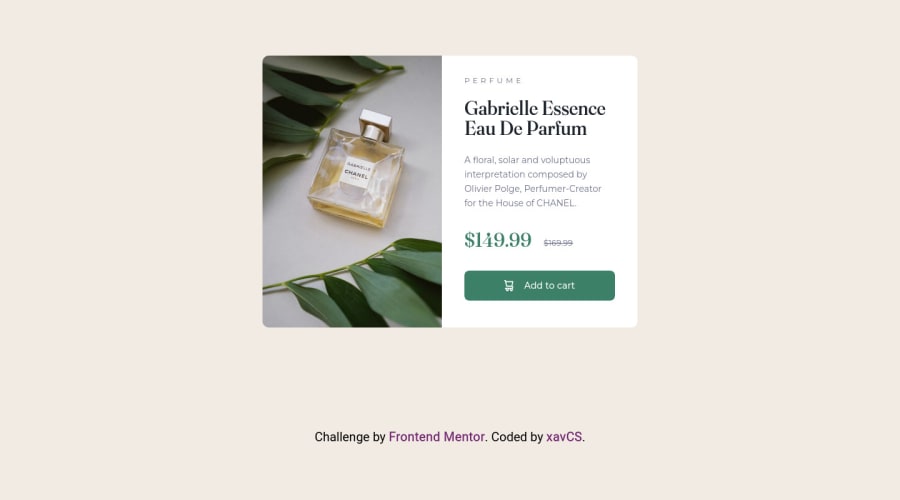
Hi, this is my first solution on Frontend Mentor for the product preview card component The main challenges for me were positioning and layout in terms of responsiveness i.e., using different displays like flexbox
I tried to lay my CSS out in a way that made sense e.g., creating rulesets per element as you go down the card or at least I tried to follow that order (it might be broken a couple times), if anyone has comments on my layout practice I would welcome them.
I probably didn't need to use a main tag in the HTML but I'm not very familiar with accessibility conventions yet, looking to practice that some more after this project
For some reason, I could not get the card to stay centered and the attribution text to stay at the bottom of the screen without something in the layout messing up, could anyone help me out with that?
I think generally this was a nice project and I found sizing to be okay with Figma but maybe I should have relied on it a bit less, I'm not sure if my way of setting widths etc. is the best way, if anyone has a better solution I'd be happy to see it.
Community feedback
Please log in to post a comment
Log in with GitHubJoin our Discord community
Join thousands of Frontend Mentor community members taking the challenges, sharing resources, helping each other, and chatting about all things front-end!
Join our Discord