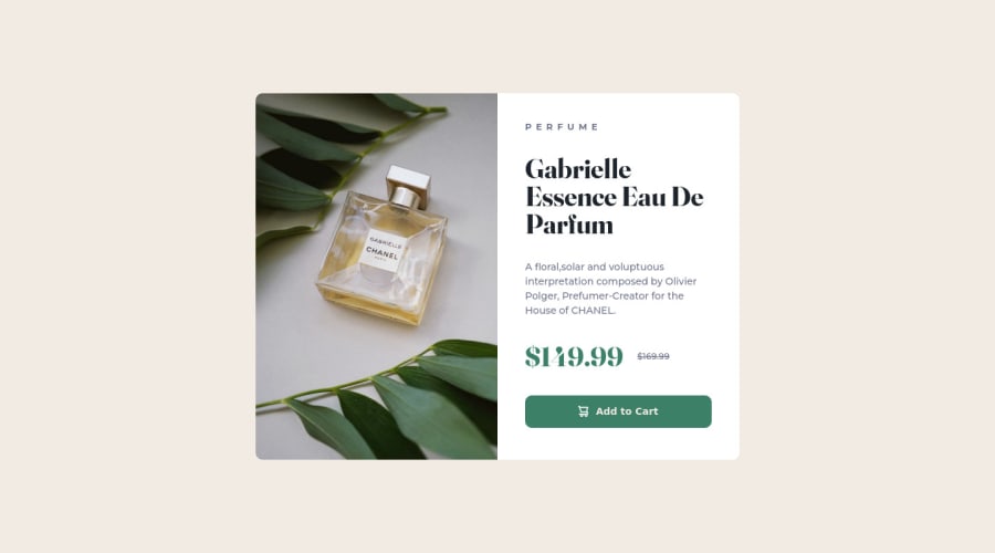
👩💻 Responsive product preview card using css flexbox
Design comparison
Solution retrospective
I would like to receive feedbacks of this challange, feel free to comment about best practices and what i could improve.👋
Community feedback
- @elaineleungPosted over 2 years ago
Hi Caroline, welcome to Frontend Mentor, and congrats on completing your first challenge! Your solution looks pretty close to the design, and the responsiveness was also done well. I just got two small suggestions:
-
It looks like you were trying to center the component, because I can see that you got flexbox on the body selector already with the correct
align-items
andjustify-content
values. The only thing you're missing ismin-height: 100vh
, so try putting that in and see what happens! -
You may want to add a 1rem padding/margin around the component, as I find that when shrinking the browser window, the browser sides are touching the container.
Once well, well done, and keep going! 🙂
Marked as helpful2@CarolAmorimPosted over 2 years ago@elaineleung Thanks for the feedback, I will apply your suggestions.😃
1 -
- @correlucasPosted over 2 years ago
👾Fala Caroline, beleza?
Vi aqui que a maioria das pessoas já deixaram outras dicas, sua solução já está bem completa e responsiva. Você fez muito bem a versão desktop e mobile.
Se você quiser só adicionar um detalhe a mais pra deixar o container super responsivo na versão mobile, talvez você possa colocar uma media query fazendo o preço e desconto em linhas diferentes pra sobrar mais espaço quando a janela encolher demais. Vou deixar o código da media query aplicada abaixo:
@media (max-width: 280px) { .card-price { display: flex; flex-direction: column; }}
Parabéns pela solução, ficou impecável.
Marked as helpful1@CarolAmorimPosted over 2 years ago@correlucas Muito obrigada pelo feedback 🤩. Com certeza vou aplicar sua sugestão e ver como vai funcionar.
1 - @IanFariasPosted over 2 years ago
Very good, congrats! I just have a few suggestions that I think you could work on. First of all, in the "add to cart" button, it's better to use the actually button tag's for acessibility. Because links (tag <a>) should be use when the click action redirect you to another page or place. And button's are for other actions that not necessarily redirects the user. Another thing is, it's better to try to represent in code what are you seeing in the layout, if something looks like a button, then it's probably one (not necessarily, but it's something to think about it). Last thing, always put some alt text in images, even if they are decorative. If the image is irrelevant to someone using a screen reader, you can hide it using aria-hidden="true".
Marked as helpful0@CarolAmorimPosted over 2 years ago@IanFarias Thank you, I really appreciated your tips, it will really to help me improve the challange.
0
Please log in to post a comment
Log in with GitHubJoin our Discord community
Join thousands of Frontend Mentor community members taking the challenges, sharing resources, helping each other, and chatting about all things front-end!
Join our Discord