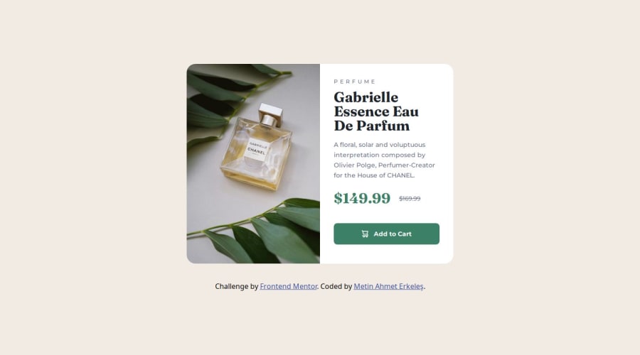
Responsive Product Preview Card using CSS Flexbox
Design comparison
Solution retrospective
I'm happy to code another design. I learned many different new things on this journey. I am happy that I can code the design for mobile and desktop screens.
What challenges did you encounter, and how did you overcome them?I thought a lot about whether I should start coding from mobile design or desktop design. I think starting from mobile design is a much better solution.
What specific areas of your project would you like help with?Responsive layout
Community feedback
- @Grego14Posted 11 months ago
👋 Hello! 🎉 Congratulations on completing the challenge! 🎉
I recommend you remove those heights that you placed on the .container element and also that
overflow: hiddensince on smaller screens or horizontally placed devices it can cause overflows and non-visible content.I think you forgot to remove the text from the alt attribute in the image, also remember to add it if the image has a semantic meaning or is not for decoration. And if you add it, remember to use descriptive text.
To prevent text wrap in the span element inside the button you can use something like this:
max-width: max-contentinstead ofmax-width: 85pxor just remove that max-width!I hope this helps! 😁
Marked as helpful0@metinahmeterkelesPosted 11 months ago@Grego14 Thank you very much for your recommendations
0
Please log in to post a comment
Log in with GitHubJoin our Discord community
Join thousands of Frontend Mentor community members taking the challenges, sharing resources, helping each other, and chatting about all things front-end!
Join our Discord
