Design comparison
Community feedback
- @correlucasPosted over 2 years ago
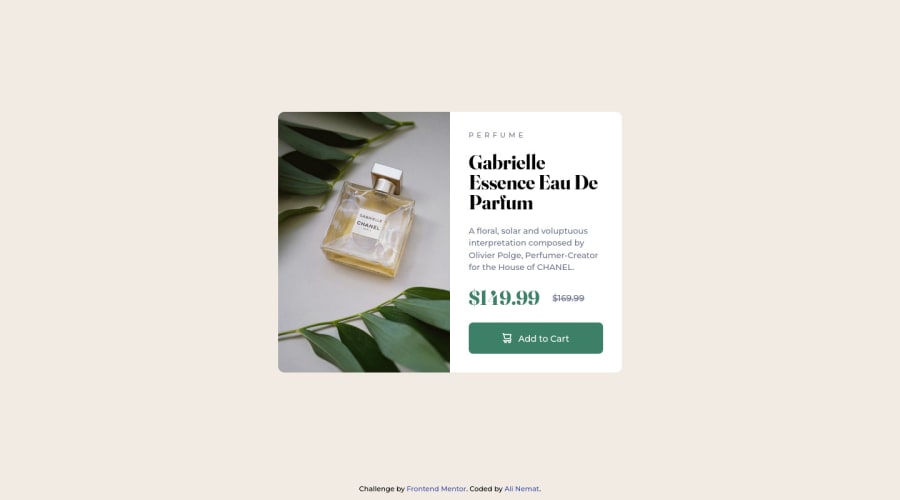
Hello Ali Nemat, congratulations for you solution!
Everything is working properly and the design match, is a really accurate solution. If you want to reach another level of responsibility you can add
flex-direction: column;to your section where there's the price to avoid the price(without discount) poping out of the container. Look that this is a fine adjustment, you already reach the challenge goals. In addition you can consider using rem over px to have a better performance in multiple screen sizes..flex { display: flex; flex-direction: column; }Hope it helps you! Happy coding.
Marked as helpful1@AliNemattPosted over 2 years ago@correlucas Hi dear Lucas
I greatly appreciate your kind word. Thanks for your attention and great advices! I'll definitely implement your recommendations in my future codes!
1
Please log in to post a comment
Log in with GitHubJoin our Discord community
Join thousands of Frontend Mentor community members taking the challenges, sharing resources, helping each other, and chatting about all things front-end!
Join our Discord
