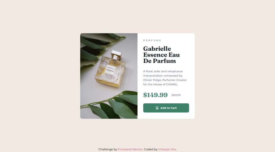
Responsive product preview card using CSS flex and grid
Design comparison
Solution retrospective
I used mobile first approach where I coded the mobile design first, then expanded into the desktop design. I'm happy it turned out well, and similar to the design given
I still use fixed units (px) for media query, and I think next time I should practice using em in media query to make it even more responsive.
What challenges did you encounter, and how did you overcome them?I'm most used to manually coding image sizes when doing responsive design, but this time I implemented picture in my html with source srcset media which made the process a lot easier. This also educated me as a designer that I should provide separate image of different dimensions for the developer when handing in my designs.
This time, the figma file given did not have specific padding and margin given to use, so I had to eyeball the padding within the card.
What specific areas of your project would you like help with?Please let me know if my website is responsive enough, and if there's any areas, especially responsive code, that I need more work on.
Community feedback
Please log in to post a comment
Log in with GitHubJoin our Discord community
Join thousands of Frontend Mentor community members taking the challenges, sharing resources, helping each other, and chatting about all things front-end!
Join our Discord
