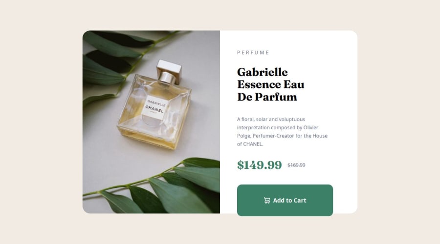
Design comparison
Solution retrospective
I’m really proud of how I implemented Flexbox to create a responsive layout that adapts well to different screen sizes, especially with the product preview card component. I feel like the CSS structure is clean, and the use of Flexbox has made the layout quite flexible across devices. I also feel good about using semantic HTML5 elements and ensuring accessibility, as I aimed to make the page usable for all users, which is a key aspect I’ve been working on improving.
Next time, I would try to implement CSS Grid more effectively, as I feel I could’ve used it in some parts of the design for better control and alignment, especially when arranging multiple elements in a container. I’d also explore using SASS or CSS custom properties to improve scalability and organization of my styles. While the current implementation works well, introducing variables and a more modular approach would make future projects easier to manage.
What challenges did you encounter, and how did you overcome them?Challenge 1: Aligning elements properly across different screen sizes At first, I had issues with centering the container both horizontally and vertically on larger screens. The layout wasn’t as fluid as I wanted it to be. I overcame this by thoroughly exploring Flexbox properties like justify-content and align-items, and using height: 100% for the parent elements to ensure proper centering. Adjusting the height of certain elements also helped me achieve the desired result.
Challenge 2: Managing content overflow on smaller screens I ran into problems where the content was overflowing on smaller screens, particularly when I had to allow for scrolling. The container padding was causing the text and buttons to spill out. I resolved this by adjusting padding and reducing line heights for better space management.
What specific areas of your project would you like help with?Code Quality and Flexbox/Grid Skills: I’m looking for tips on how to write cleaner and more maintainable CSS. I want to improve my organization and structure, especially when working with Flexbox and Grids. Any advice on best practices or design patterns for responsive layouts would be really appreciated.
Flexbox/Grids Strengths: I’d love to hear some feedback on how I can get stronger with Flexbox and Grid. Sometimes I feel like I’m not utilizing their full potential, and I’m unsure of when to choose Flexbox over Grid or vice versa. If anyone has suggestions on how to improve my use of these CSS properties for complex layouts, that would be very helpful.
Community feedback
- @ProfessoraBiancaPosted 6 days ago
Hello! You did really well in this challenge!
Some things I think you can improve based on my take of the challenge:
You could try using the
<picture>tag in HTML. This offers the option of changing theimgbased on thewidthof the display. (That's why Frontend Mentor included 2 images as resources)Personally I used only
flexfor this challenge. I think It was a good decision of yours.A question:
The live site shows everything disconfigurated. The text overflows the card in desktop view and the
<button>overflows in the mobile. Did you checked this problem?Marked as helpful0P@MuskaanVashPosted 5 days ago@ProfessoraBianca hey there, thanks for giving me some insights, actually i created the designs on a screen size of 27 inch, and then later when i viewed the page on a 13 inch laptop, they did look disoriented, but i did some changes currently and now even though everything looks intact on both my devices. i am still not able to understand how to keep all these things into consideration on one device, because checking everything on various devices is complicated. that pretty much means dev tools i am using for checking the layout is also working differently on diff screen sizes. that is really messing up with me. any insights on what i can do to make it better! also on uploading a new screenshot here, the button still shows as if flowing out of the container, but i checked using dev tools on various screen sizes and their devices as well, and it seems okay and contained. idk why the screenshot now is still showing the content to be flown out. it is my first hands on project and i am freaking out over how to improve this and keep everything into consideration.
0
Please log in to post a comment
Log in with GitHubJoin our Discord community
Join thousands of Frontend Mentor community members taking the challenges, sharing resources, helping each other, and chatting about all things front-end!
Join our Discord
