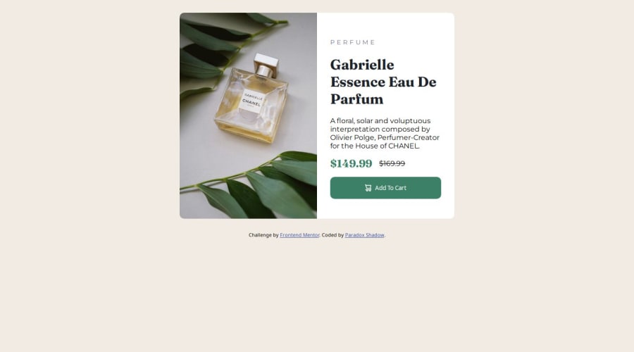
Design comparison
Solution retrospective
I am happy with the responsiveness. Although it is not perfect, but still I was able to learn about the responsive units and used them in my design. Next time I will improve on this.
What challenges did you encounter, and how did you overcome them?The media queries are still a bit challenging. There are many great resources out there that goes in great detail in explaning them. That was a big help.
What specific areas of your project would you like help with?I will keep working on the responsive design. I had a bit of trouble in setting the margin around the main element. Curretly I am using clamp, is there a better way to do it?
Community feedback
- P@brunagoncalvesPosted 5 months ago
Your code is well-structured! Very good. However, I would make a few adjustments:
-
Remove the inline .attribution styling from the HTML and add it to the CSS file to keep the HTML cleaner and centralize all styles.
-
Apply a slight transition effect on the button for a smoother hover effect:
transition: background-color 0.3s ease;. -
Set
--font-primaryon thebodyand adjust it as needed. -
Add a specific font style to the button.
-
Remove margin: 0 from the body and use a simple CSS reset instead, like
* { margin: 0; padding: 0; box-sizing: border-box; }. -
Add
padding: 1rem;to thebody, so the card doesn’t touch the screen edges on smaller viewports.
Marked as helpful1 -
Please log in to post a comment
Log in with GitHubJoin our Discord community
Join thousands of Frontend Mentor community members taking the challenges, sharing resources, helping each other, and chatting about all things front-end!
Join our Discord
