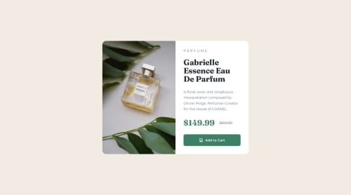
Submitted over 1 year agoA solution to the Product preview card component challenge
Responsive Product Preview Card
accessibility
@jubileelin

Solution retrospective
What are you most proud of, and what would you do differently next time?
I struggled quite a bit on this challenge because it was my first introduction to responsive design. I initially made a version which had a lot of media queries and did not work very well. However, after taking some time to research responsive units and functions, I started the project again from scratch and was able to come up with this final version.
What specific areas of your project would you like help with?Although this project was extremely helpful in giving me more insight into responsive design, I still want to try to get more comfortable in responsive design and units.
Code
Loading...
Please log in to post a comment
Log in with GitHubCommunity feedback
No feedback yet. Be the first to give feedback on jubileelin's solution.
Join our Discord community
Join thousands of Frontend Mentor community members taking the challenges, sharing resources, helping each other, and chatting about all things front-end!
Join our Discord