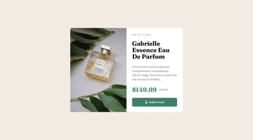
Not Found
Not Found
Not Found
Not Found
Not Found
Not Found
Not Found
Not Found
Not Found
Not Found
Not Found
Not Found
Not Found
Not Found
Not Found
Not Found
Not Found
Not Found
Not Found
Not Found

Submitted

Responsive Product Preview Card Page

Bart Feesleyā€¢ 220

@antimatterhut

Desktop design screenshot for the Product preview card component coding challenge

This is a solution for...

  • HTML
  • CSS
1newbie
View challenge

Design comparison


SolutionDesign

Solution retrospective


What are you most proud of, and what would you do differently next time?

I was proud of the fact that I started with mobile and transitioned to desktop with media queries so easily.

What challenges did you encounter, and how did you overcome them?

I was challenged with the picture and the border radius. I was confused at first bc the card had a br aswell as the picture. I didn't know that you could make one side rounded and the other not.

What specific areas of your project would you like help with?

I would like help with knowing whats optimal as opposed to what just happened to work for me.

Community feedback

Mahmoodā€¢ 1,070

@MahmoodHashem

Posted

Hey there! šŸ™‹šŸ½ā€ā™‚ļø

Congrats on finishing the challenge! āœ…

Your project looks awesome!

Here are some helpful tips that you might find useful:

Firstly:

The border-radius property can take one to four values, depending on how you want to specify the rounding for each corner:

  1. Single value : If you provide a single value, it applies the same radius to all four corners.
   border-radius: 10px;

2.Two values : If you provide two values, the first value applies to the top-left and bottom-right corners, and the second value applies to the top-right and bottom-left corners.

   border-radius: 10px20px;

3.Three values : If you provide three values, the first value applies to the top-left corner, the second value applies to the top-right and bottom-left corners, and the third value applies to the bottom-right corner.

   border-radius: 10px20px30px;

4.Four values : If you provide four values, they apply to the top-left, top-right, bottom-right, and bottom-left corners, respectively, in that order.

   border-radius: 10px20px30px40px;

So, you can have one side of an element rounded while the other side remains sharp.

For example, let's say you have a card element with a picture inside it. You could apply the following border-radius values:

.card {
border-radius: 20px20px00;
}

.card-picture {
border-radius: 0020px20px;
}

Secondly:

šŸ“Œ When you have different versions of the same image, consider using the <picture> tag.

This will help ensure the correct image loads on the user's device, saving bandwidth and boosting performance.

Example:

<picture>
    <source media="(min-width: 768px)" srcset="{desktop image path here}">
    <img src="{mobile image path here}" alt="{alternative text here}">
</picture>

Hope you find this useful!

Great job overall!

Marked as helpful

0

Bart Feesleyā€¢ 220

@antimatterhut

Posted

@MahmoodHashem Thanks dude, I had no idea about the picture tag!

1
Bart Feesleyā€¢ 220

@antimatterhut

Posted

@MahmoodHashem Thanks dude, I had no idea about the picture tag!

1

Please log in to post a comment

Log in with GitHub
Discord logo

Join our Discord community

Join thousands of Frontend Mentor community members taking the challenges, sharing resources, helping each other, and chatting about all things front-end!

Join our Discord