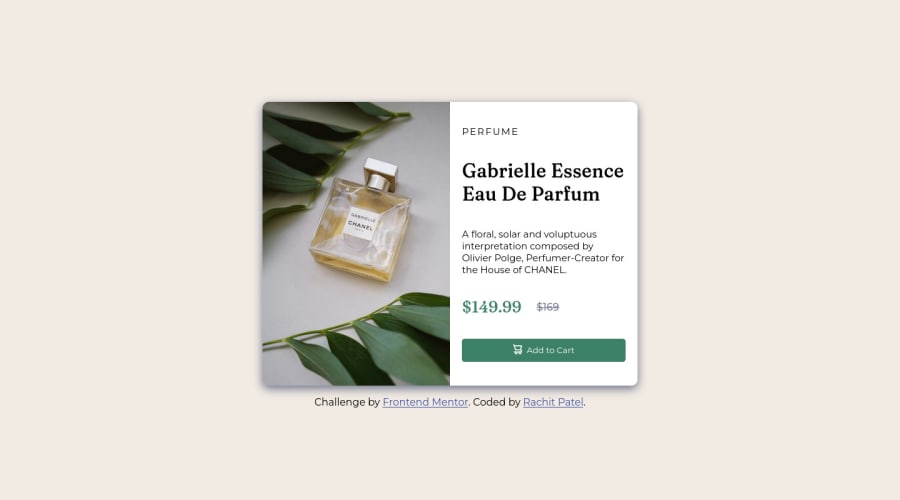
Design comparison
Community feedback
- @VCaramesPosted about 2 years ago
Hey @rachit0706, some suggestions to improve you code:
- For this challenge you want to use the Picture Element not the Background Image Property. The Background Image Property is mainly used on decorative images
Picture Element will allow your to switch between images in different breakpoints and makes your site load faster by saving bandwidth.
Here is an example of how it works: EXAMPLE
Syntax:
  <picture>
    <source media="(min-width: )" srcset="">
    <img src="" alt="">
  </picture>
More Info:
https://www.w3schools.com/html/html_images_picture.asp
https://web.dev/learn/design/picture-element/
-
Once you fix the image implementation, you'll want to include an Alt text tag with them. Inside that Alt Tag you want to describe what the image is; they need to be readable. Assume you’re describing the image/icon to someone.
-
There is only one heading in this challenge and that is the name of the perfume, “Gabrielle Essence Eau De Parfum”.
-
The old price 🏷 is not being announced properly to screen readers. You want to wrap it in a Del Element and include a sr-only text explaining that this is the old price.
-
Your button needs
:hovereffect andcursor: pointer. -
On your button use
display: flexalong withalign-items: centerto have them perfectly aligned like the FEM example. -
The background color should be applied to the Body Element no the Main Element.
Happy Coding! 👻🎃
Marked as helpful0
Please log in to post a comment
Log in with GitHubJoin our Discord community
Join thousands of Frontend Mentor community members taking the challenges, sharing resources, helping each other, and chatting about all things front-end!
Join our Discord
