Submitted 6 months ago
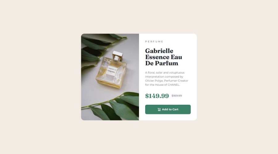
Responsive product preview card exercise using felxbox

@thetinyelephant85

Design comparison
SolutionDesign

Solution retrospective
What are you most proud of, and what would you do differently next time?
I created the structure in html faster with a mobile first approach, with just a few changes later for desktop rendering.
Next time I will try to build responsive css using rem immediately rather than changing from px later,
What challenges did you encounter, and how did you overcome them?At first I was unsure whether to use flexbox or grid and how to achieve the clear 50% split between image and content in the desktop view.
I searched through the docs and ended up going with the flex basis. Still not sure if this is the best solution though.
What specific areas of your project would you like help with?Still not sure when to use rem vs em vs vw for font size, spacing or viewport breakpoint.
Community feedback
Please log in to post a comment
Log in with GitHub
Join our Discord community
Join thousands of Frontend Mentor community members taking the challenges, sharing resources, helping each other, and chatting about all things front-end!
Join our Discord