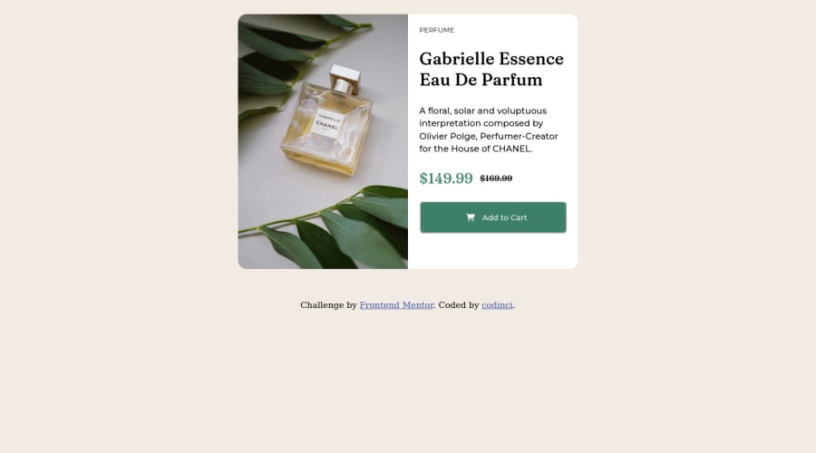
Design comparison
Solution retrospective
I'd like to receive feedback on explicitly sizing the card. Is this a best practice when it comes to responsive web design?
Community feedback
- @milosshomyPosted about 2 years ago
Hey! Good job on completing this challenge. As what I can see from your code , use min-height:100vh; on your container , that way card will be centered properly. And one more thing avoid fixed height unless you really need to do it , instead use min-height , that way it will be responsive. Happy coding!
Marked as helpful0 - @NIk22517Posted about 2 years ago
Hey @codinci, I'm impressed how much your first challenge is good the design is basically matching the figma files, amazing!
Here's one tip about semantics for you:
Improve the semantics by replacing the
<div>
and using<section>
which is a better tag, remember that <div> doesn’t have any practical meaning is just a block of elements, so for a big block of elements use semantic tags.This is a good resource to understand more about
semantic tags:
https://www.w3schools.com/html/html5_semantic_elements.asp
Remover border from the bottom
And for the
<img>
tag try using You have used background-image instead of using background-image you can use<picture> <source srcset="mobile.jpg" media="(max-width: 620px)" /> <img src="desktop.jpg" alt="Office Workers Smiling" /> </picture>
✌️ I hope this helps you and happy coding!
Marked as helpful0@codinciPosted about 2 years ago@NIk22517 Thank you for even taking time to notice, will definitely implement those changes. Thanks again for the helpful feedback.
0
Please log in to post a comment
Log in with GitHubJoin our Discord community
Join thousands of Frontend Mentor community members taking the challenges, sharing resources, helping each other, and chatting about all things front-end!
Join our Discord