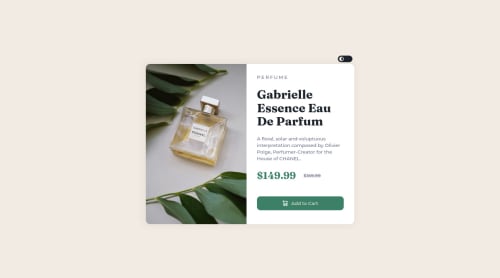
Not Found
Not Found
Not Found
Not Found
Not Found
Not Found
Not Found
Not Found
Not Found
Not Found
Not Found
Not Found
Not Found
Not Found
Not Found
Not Found
Not Found
Not Found
Not Found
Not Found

Submitted

Responsive Product Preview Card Component with Darkmode using SASS

@mbonamensa

Desktop design screenshot for the Product preview card component coding challenge

This is a solution for...

  • HTML
  • CSS
1newbie
View challenge

Design comparison


SolutionDesign

Solution retrospective


I started the project mobile-first and I struggled a little switching from using <img> to background-image because I realized there had to be a change in images in the desktop view. I'd like to know if anyone used <img> all the way for both mobile and desktop and how you went about it. Also please feel free to point out any best practices I may have missed. Thanks.

Community feedback

@MelvinAguilar

Posted

Hi @mbonamensa πŸ‘‹, good job for completing this challenge!

In addition to the above comments and answering your question, you can use <picture> tag when you need to change the image on different viewports, using this tag will prevent the browser from loading both images, saving bandwidth and preventing you from using a media query to modify the image More information here

Example:

<picture>
   <source media="(max-width: 545px)" srcset="./img/image-product-mobile.jpg">
   <img src="./img/image-product-desktop.jpg" alt="your_alt_text">
</picture>

In this solution you should not use the background property to set the image because this image has an important semantic meaning, use CSS background property if the image is not part of the content.

Good Job and happy coding !

Marked as helpful

1

@mbonamensa

Posted

@MelvinAguilar Thank you for taking the time to answer my question and adding resources I can read. This is helpfulπŸ‘πŸΎ

1

@Mosestule2003

Posted

Hey πŸ‘‹, really love your solution πŸ‘Œ. Just a few tips that can help out.

  • I noticed you added a feature to your work to alternate background colors. Try adding a box shadow to your card container to express it more on the white background.
  • Also in terms of using image, what I usually do is create a custom image class and assign it to my desired image element. Then in css I add ( width: 100%, height: 100%, and object-fit: cover:). This works really well, and I can persist the custom image name wherever I want to use an image element. Hope this helped, happy coding πŸ‘¨πŸΎβ€πŸ’»πŸ‘

Marked as helpful

1

@mbonamensa

Posted

@Mosestule2003 Thank you for taking the time to give me feedback πŸ‘Œ

0

@Mosestule2003

Posted

@mbonamensa it's alright, happy coding πŸ‘¨πŸΎβ€πŸ’»

0

Please log in to post a comment

Log in with GitHub
Discord logo

Join our Discord community

Join thousands of Frontend Mentor community members taking the challenges, sharing resources, helping each other, and chatting about all things front-end!

Join our Discord