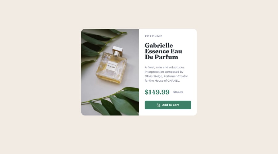
Responsive Product Preview Card Component - Using picture element
Design comparison
Solution retrospective
The part I found hard and took me about 2 weeks to get it was changing the product images when the screen size changes, I have seen a lot of approaches (using as background, using transform, ...) but I decided to do it using the "picture" element. But it also had some trouble with it, and it was an 18px line below the product pictures. For that I used "display: block;" on the img. What I could do to make my project better? There is a more simple way to do it?
Community feedback
- @LorenaFriasPosted about 2 years ago
Hi @mbedon! Your solution looks great! Your approach was quite accurate to me. Mind you, I'm still learning, but you could try using a css reset:
img { display: block; max-width: 100% }Since images are inline elements display: block should get rid of that unexpected gap and max-width:100% prevents large images from overflowing their container. Hope that was helpful!Marked as helpful0 - @yishak621Posted about 2 years ago
Hi welcome to front end challenges ..there is two images given in the images folder one for 1x version(mobile) and the other 2x version (pc) is for the higher resolution screens....so the main idea in these challenge is to swap the images when the screen size changes from smaller screen sizes to larger screen sizes ...so that will be achieved by resolution switching method in html srcset attribute ....so the DOM will load the image depending in the screen sizes
```css
  <div class="image">
         <picture>
           <source
       srcset="images/[email protected] 750w, images/[email protected] 1200w"   />
<img src="images/[email protected]" /> </picture> </div>0
Please log in to post a comment
Log in with GitHubJoin our Discord community
Join thousands of Frontend Mentor community members taking the challenges, sharing resources, helping each other, and chatting about all things front-end!
Join our Discord
