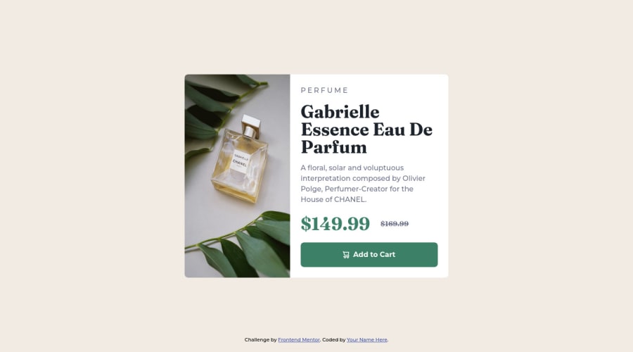
Responsive product preview card component using HTML & CSS.
Design comparison
Solution retrospective
Feel free to add to comment about my project work & advise me.
Community feedback
- @correlucasPosted about 2 years ago
👾Hello Raihan Noor, Congratulations on completing this challenge!
You’ve done really good work here putting everything together, I’ve some suggestions you can consider applying to your code to improve the html markup/semantic:
1.You did a good work putting everything together in this challenge, something you can do to improve the image that needs to change between mobile and desktop is to use
<picture>
instead of<img>
wrapped in a div. Look that for SEO and search engine reasons isn’t a better practice import this product image with CSS since this will make harder to the image be found. You can manage both images inside the<picture>
tag and use the html to code to set when the images should change setting the devicemax-width
depending of the device (phone / computer) Here’s a guide about how to usepicture
:https://www.w3schools.com/tags/tag_picture.asp
2.You’ve used
px
as the unit for sizes but the problem with pixels is that its not optimized for multiple devices and screens. So a good fit its to userem
orem
that have a better performance and make your site more accessible between different screen sizes and devices.REM
andEM
does not just apply to font size, but to all sizes as well.✌️ I hope this helps you and happy coding!
Marked as helpful0@raihannoorhasanPosted about 2 years agothank you so much for your great advice @correlucas. Surely, i will apply it.
1 - @hmadamkPosted about 2 years ago
- great work
- make sure that all of your page is contained by a landmark examples of landmarks are
header for the top section main for your main section section with aria-label to describe why you added this section footer for the bottom section
the main landmark is required an represent the most important section in your case where you use a card you should wrap it inside of main to give it semantic meaning
- hope this helped
Marked as helpful0@raihannoorhasanPosted about 2 years agoThank you for your suggestion @hmadamk . Can you please give me example for better understanding of main landmark?
0@hmadamkPosted about 2 years ago@raihannoorhasan the main landmark does not have so much styling attach to it so you use it in place of div you can even give it the same class and you would not notice the difference but the difference is huge it makes assistive technology lead non-sighted user who want to skip right into your content to do it easily, beside in a huge page where there thousand of landmarks it would be wild to use div only it will make debugging a nightmare but main, header, section, footer is more semantic and meaningful and it document your code for furthur using
- hope this helped if you have any other question in javaScript, CSS, HTML semantic, accessibility I will be glad to help
0@raihannoorhasanPosted about 2 years ago@hmadamk thanks brother, you're very helpful. I will surely questioned you if i stuck anywhere, thanks for your kindness! take love!!
0
Please log in to post a comment
Log in with GitHubJoin our Discord community
Join thousands of Frontend Mentor community members taking the challenges, sharing resources, helping each other, and chatting about all things front-end!
Join our Discord