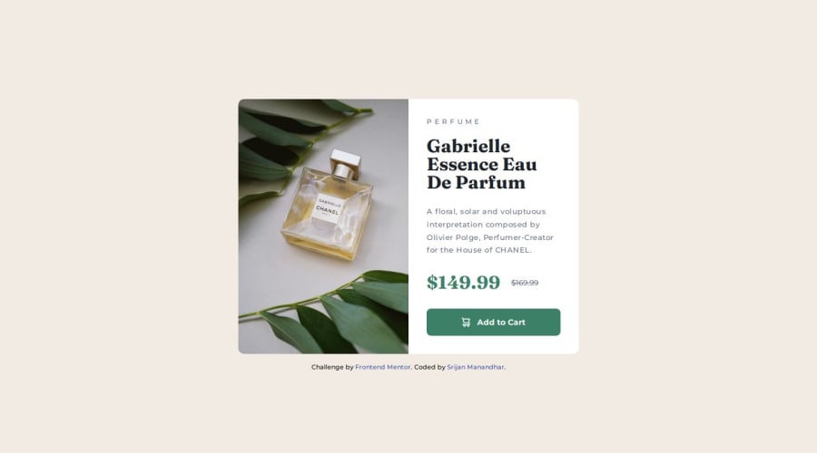
Responsive product preview card component using flexbox
Design comparison
Solution retrospective
I got to learn about HTML elements like
I've use PostCSS and its different plugins
learned about how we can separate CSS into different files and import into the main CSS file. used mixins which helps us to reuse CSS without repeating in different places. used nested CSS And to build this postcss I've used 'Vite'. It is very helpful tool for development and also for deployment of production build to Github pages.
What challenges did you encounter, and how did you overcome them?- I followed mobile first layout and used flexbox to card component.
- then for desktop view I changed the flex direction to row and used flex: 1 to both image and product__info component
- this worked fine in Chrome and Edge, but firefox and Safari was giving issue
- later I figured out that I have to give 50% width to element to take the half width of the card element, even though I have already set flex: 1 to img element
- Any feedback is welcome
Community feedback
- P@danielmrz-devPosted 11 months ago
Hello there!
Congrats on completing the challenge! ✅
Your project is looking fantastic!
I'd like to suggest a way to make it even better:
- Using
marginand/orpaddingisn't always the most effective method for centering an element.
Here's a highly efficient approach to position an element at the center of the page both vertically and horizontally:
📌 Apply this CSS to the body (avoid using
positionormarginsin order to work correctly):body { min-height: 100vh; display: flex; justify-content: center; align-items: center; }I hope you find this helpful!
Keep up the excellent work!
Marked as helpful1 - Using
- @AkoToSiJeromeEhPosted 11 months ago
Hey ! Great work out there i just notice that you are using margin in order to center the card component but does seem work , i suggest that you can use display : flex to center the card component since you are using it on .product , you can add d-flex on body with its related properties and also a height for proper alignment by adding that on body you can vertically and horizontally aligned the card component . that's all happy coding !
you can see the difference when you inspect and zoom-in and zoom-out , notice that the card will behave on its position by adding those properties in body.
body {
  background-color: #f2ebe3;
  background-color: var(--background-color);
  font-family: Montserrat,sans-serif;
  font-family: var(--primary-font);
  font-size: 16px;
  font-size: var(--default-font-size);
  display: flex; // add this
  flex-direction: column; // add this
  align-items: center; // add this
  justify-content: center; // add this
  min-height: 100vh; // add this
}
main { padding: 10.9375rem 0 0; // remove this } }Marked as helpful1
Please log in to post a comment
Log in with GitHubJoin our Discord community
Join thousands of Frontend Mentor community members taking the challenges, sharing resources, helping each other, and chatting about all things front-end!
Join our Discord
