Submitted about 2 years ago
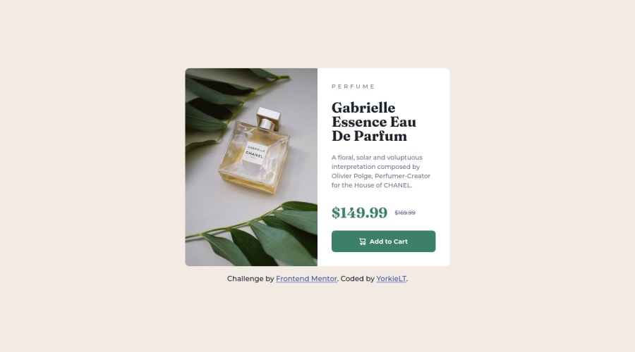
Responsive Product preview card component using CSS Grid/Flexbox
@TanDevv
Design comparison
SolutionDesign
Solution retrospective
I found this project fairly straight-forward using a mix of CSS Grid and Flexbox, although the hurdle I did get stuck with for a small amount of time was the button and the SVG icon. I found from research you can use the data-icon attribute to implement the icon which worked for me but is that a good way to do it? Could I have done it differently?
Overall feedback and/or suggestions of code changes would be greatly appreciated for me to take into my next projects. :)
Community feedback
Please log in to post a comment
Log in with GitHubJoin our Discord community
Join thousands of Frontend Mentor community members taking the challenges, sharing resources, helping each other, and chatting about all things front-end!
Join our Discord
