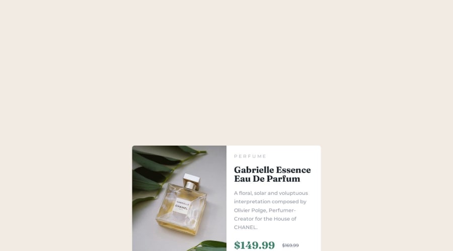
Responsive product preview card component using CSS grid & flexbox


Design comparison

Solution retrospective
This project reminded me about some css fundamentals that I learned when I started learning web development, but haven't used enough to use properly.
One of my questions has to do with the approach of this project: when I first learned html and css, I learned through building websites for desktop computers, but every other source I've seen since has argued for mobile first approach. When I started this challenge, ran into some obstacles after trying to construct my html from a mobile-first perspective rather than the desktop version. Is this something that gets easier with time and practice, or is there something fundamental that I'm missing?
Community feedback
- @peanutbutterjllyPosted almost 2 years ago
hey 👋,
its heavily preached to do a mobile-first design (and for valid reasons) but when I do projects here I usually do a desktop first design to bang out solutions quickly as its easier for me to work that way - I primarily do desktop web-apps for a living so its just how my brain works most the time.
I try and do a mobile-first approach on my personal projects but that doesn't always go as planned 🥴.
your solution looks great but I would just change some body styles:
body {
min-height: 100vh;
}
you have it currently set at 100vw and that's why the body takes up so much space.
keep up the good work 👍
Marked as helpful0P@nataliesmythPosted almost 2 years ago@peanutbutterjlly Oh my god!!
Thank you so so much!
I didn't realize until after I submitted this solution that the body was so large, and once I realized I couldn't figure out what the problem was. Now I know that I need to spend more time understanding view height and view width.
I learned html and css from a desktop first approach and have a hard time switching to mobile-first. There have been projects where it makes sense, but then I tried another challenge from this website (which I am about to submit) and it was really hard for me to go from mobile to desktop, even though I was confident I knew how to create the desktop version.
Thank you so much for your feedback!
1

Please log in to post a comment
Log in with GitHub
Join our Discord community
Join thousands of Frontend Mentor community members taking the challenges, sharing resources, helping each other, and chatting about all things front-end!
Join our Discord