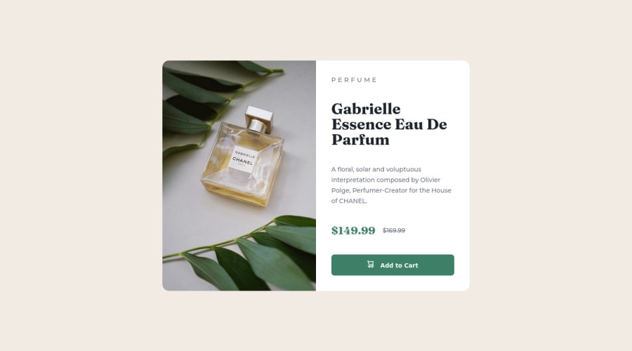
Responsive Product preview card component using css flexbox and grid
Design comparison
Solution retrospective
Though I was able to achieve the desired result, I'm not sure if I am following the best practices. Any help, criticism or feedback is welcome, I am here to learn!
Community feedback
- @VCaramesPosted over 2 years ago
Hey there! 👋 Here are some suggestions to help improve your code:
-
The purpose of the <Main> Element is to identify the main content off your page; It is not the container of you component. Inside the <Main> Element, you will want to create a new container and place your component inside that new container.
-
The only heading in this challenge is the name of the perfume, “Gabrielle Essence Eau De Parfum” . The rest of the text should be wrapped in a Paragraph Element.
-
The old price 🏷 is not being announced properly to screen readers. You want to wrap it in a Del Element and include span element with an sr-only text explaining that this is the old price.
If you have any questions or need further clarification, feel free to reach out to me.
Happy Coding! 👻🎃
Marked as helpful0@damagermaxPosted over 2 years ago@vcarames Thank you for the feedback. I will work on it.
0 -
Please log in to post a comment
Log in with GitHubJoin our Discord community
Join thousands of Frontend Mentor community members taking the challenges, sharing resources, helping each other, and chatting about all things front-end!
Join our Discord
