Submitted over 2 years ago
Responsive product preview card component using CSS flexbox

@KellyCHI22

Design comparison
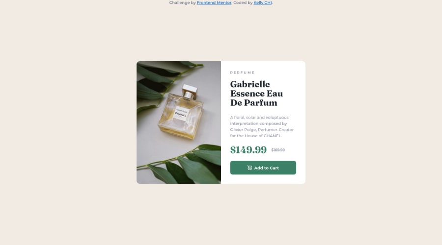
SolutionDesign

Solution retrospective
Hi there, thanks for reviewing my code. After seeing a few solutions by other people, I found accessibility is a big topic to work on. Any suggestions or tips for starting to increase accessibility in all projects?
Community feedback
Please log in to post a comment
Log in with GitHubJoin our Discord community
Join thousands of Frontend Mentor community members taking the challenges, sharing resources, helping each other, and chatting about all things front-end!
Join our Discord