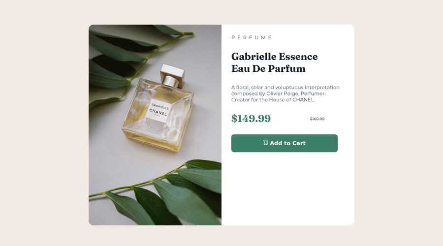
Responsive Product preview card component | React | SASS | VITE
Design comparison
Solution retrospective
Hello Developers👋
Really enjoyed working with this project 😄
As always, I'd really appreciate if you could answer the following:👇
1.What did I do wrong? 2.What did I do right? 3.How can I improve? common mistakes?
🙏Thanks in advance. Happy Coding😄
Community feedback
- @sulemaan7070Posted almost 2 years ago
hey tushar😄, I have inspected your code✅, and here are the few things you can do to improve your site
-
you have given the image
width of 100%
andheight of 100%
which you should not have. please use onlywidth: 100%
don't use height100%. as it would make the image much larger. -
I saw you have given background-color to the
.product-story
class. Instead what I suggest is give bg-color to.product-prev
orarticle
. which will ease things up for you. -
and I don't think the text area need
30vw
of width. You can work on that. -
regarding the font styles and everything you a good job💓
0@itushPosted almost 2 years ago@sulemaan7070 Thank you very much for these useful feedback. I shall implement them as per the requirements. Looking forward to receive more feedback from you in future. 🙏Thanks in advance. Happy Coding😄
0 -
Please log in to post a comment
Log in with GitHubJoin our Discord community
Join thousands of Frontend Mentor community members taking the challenges, sharing resources, helping each other, and chatting about all things front-end!
Join our Discord