Not Found
Not Found
Not Found
Not Found
Not Found
Not Found
Not Found
Not Found
Not Found
Not Found
Not Found
Not Found
Not Found
Not Found
Not Found
Not Found
Not Found
Not Found
Not Found
Not Found

Submitted

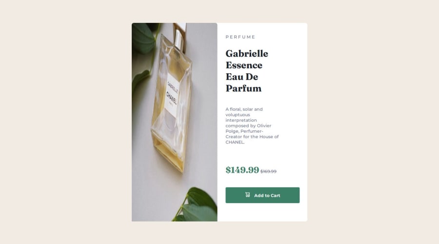
Responsive product preview card component

P

@ownedbyanonymous

Desktop design screenshot for the Product preview card component coding challenge

This is a solution for...

  • HTML
  • CSS
1newbie
View challenge

Design comparison


SolutionDesign

Solution retrospective


What are you most proud of, and what would you do differently next time?

I am happy that l was able to complete the challenge and flow the mobile-first workflow. Befor going through the articles on Frontend Mentor l never understood why it was important to build for mobile first.

What challenges did you encounter, and how did you overcome them?

I had difficulties trying to use different images for different device size. I feel my desktop is so off from what was given in the design. Creating for mobile was easy but optimizing the code to work for desktop or bigger screens was difficult

What specific areas of your project would you like help with?

Using assets optimized for different device sizes Still having knowledge gaps in the use of em and rem, Flexbox and media queries.

Community feedback

@tiagocostarebelo

Posted

Hello @ownedbyanonymous,

First, well done on submitting and pushing yourself to learn and improve.

A few things I've noticed in your code:

  • Replace <div> with a <button> where a button is intended. This improves both semantics and accessibility. Also, ensure all interactive elements are keyboard-accessible and screen reader-friendly.

  • Your <picture> element contains two sources and one img. Check the documentation on the MDN. You only need one.

  • For a faster workflow, explore CSS custom properties and how to set/use them. This will streamline your workflow and make your code cleaner.

  • You are setting the width of your article (which seems to be your card container) to 40vw, which I believe is causing issues with the desktop version. A simpler approach would be setting the width to 100% and then a max-width to the desired value, like 600px or 700px. This will improve the scalability and responsiveness of the card. The same applies to height values.

  • I also advise against adding width to <p> elements. The parent containers should handle that, not the element itself.

Hope this helps. Keep up the good work!

Best regards, Tiago

0

Please log in to post a comment

Log in with GitHub
Discord logo

Join our Discord community

Join thousands of Frontend Mentor community members taking the challenges, sharing resources, helping each other, and chatting about all things front-end!

Join our Discord