Design comparison
SolutionDesign
Solution retrospective
Hello Everyone!
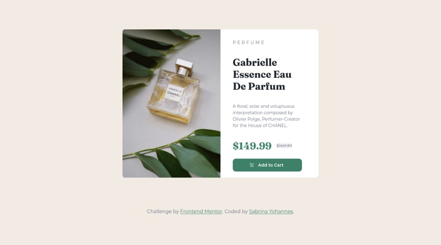
I just completed this project and I would really appreciate some feedback! I was curious if there was a more effective approach to this? I used flexbox and media query to make this page responsive and was wondering if this was the best practice?
Community feedback
- @frank-itachiPosted over 1 year ago
Hello there 👋. Congratulation for completing the challenge👍!
I have some suggestions about your code that might interest you.
HTML 📄:
- Wrap the page's whole main content in the
<main>tag. - If your code has different sections that have a specific purpose like a navigation, article, sections or footer, it’s a good practice to enclose those parts with HTML5 semantic tags. For example, you could use a
<footer>tag to wrap the<div class=”attribution”>section. - Since the mobile design has a different image, you can use the
<picture>tag that allows you to interchange the images depending of the viewport size. Red more about this awesome tag here.
CSS 🎨:
- You can also use the
text-transform: uppercase;property to make the perfume word appear in upper case even though you typed it in lower case in the HTML file.
I hope you find it useful! 😄 Above all, you did a good job!
Happy
<coding />😎!0 - Wrap the page's whole main content in the
Please log in to post a comment
Log in with GitHubJoin our Discord community
Join thousands of Frontend Mentor community members taking the challenges, sharing resources, helping each other, and chatting about all things front-end!
Join our Discord
