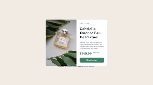
Responsive product preview card component

Solution retrospective
I am proud of how well the site turn out to be, especially after hours of trial and error.
If I were to do it again, I would have started with the mobile design, since it's less of a headache to make than the desktop design.
What challenges did you encounter, and how did you overcome them?Dealing with proportions, image ratios and remembering where half the css variables come from.
What specific areas of your project would you like help with?The css ended up looking like a mess, with all the nonsense variables that I tried to implement , half of which I completly forgot about. So I would like help in make the style.css file even one line smaller.
Please log in to post a comment
Log in with GitHubCommunity feedback
No feedback yet. Be the first to give feedback on Elias sips 🍵's solution.
Join our Discord community
Join thousands of Frontend Mentor community members taking the challenges, sharing resources, helping each other, and chatting about all things front-end!
Join our Discord