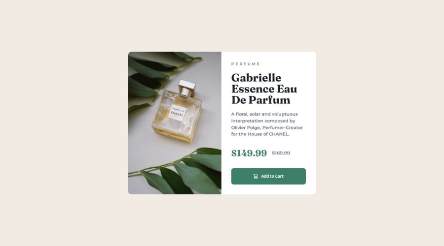
Responsive Product preview card component Css flex


Design comparison

Solution retrospective
I have issues with matching pixel for pixel. I can't exactly nail the positioning, the sizes. So its always a bit off.
Community feedback
- @gmagnenatPosted 9 months ago
Hi, congrats on completing the challenge ! it looks quite close already :)
To help you match a design you can use this perfect pixel chrome extension. You can use the snapshot present in the starter files in this extension and it will add an overlay on top of your webpage. you can move the overlay and adapt the value in the developer console, then adapt your css with the values you find.
You should add a proper css reset at the begining of your stylesheet it will help as well deal with default browser styling conflict. good and modern css reset.
I hope you find these recommendations useful. Let me know if you have any questions.
happy coding !
Marked as helpful2 - @grace-snowPosted 9 months ago
Some quick feedback
- remove explicit widths. The component should only have a max width in rem.
- fix the html. Specifically heading use and order, and use of image alt. See https://fedmentor.dev/posts/html-plan-product-preview
- use a css reset at the start of the styles.
- you shouldn't need any
!importantin the styles. That's a sign there are problems in the css. Fix them don't try and brute force override them. - don't guess font sizes. I can tell you're choosing random rem values. They shouldn't need to change between movie and desktop. Use the size the style guide says for body/paragraph.
- the img needs object-fit
- the picture element should only have one source in this for the desktop image.
- only set media queries when there is room for the layout to change. Define media queries in rem or em not px. And make the mobile styles the default with larger screen styles in the media query. See https://fedmentor.dev/posts/responsive-meaning/
Marked as helpful1 - P@danielmrz-devPosted 9 months ago
Hello there!
Congrats on completing the challenge! ✅
Your solution looks excelent!
I have just one suggestion:
📌 To improve semantic clarity, try to maintain the titles hierarchy with
<h1>,<h2><h3>, and so on.It's more than just text size — it's about structuring your content effectively:
<h1>to<h6>are used to define HTML headings, with<h1>being the most significant.
While these adjustments might not alter the visual appearance much, they significantly enhance semantic clarity, SEO optimization, and accessibility.
Hope this suggestion proves helpful! Keep up the great work!
1


Please log in to post a comment
Log in with GitHub
Join our Discord community
Join thousands of Frontend Mentor community members taking the challenges, sharing resources, helping each other, and chatting about all things front-end!
Join our Discord