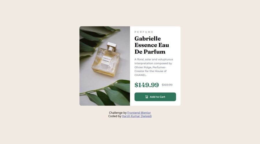
Responsive Product Preview Card Component Code
Design comparison
Solution retrospective
I am proud that I was able to build responsive webpage which is super close to the target design. From next time, I would take care of time invested in development properly because lack of a proper blueprint of development of given webpages consumes a lot of time, will try to build faster from next projects by following a structured plan.
What challenges did you encounter, and how did you overcome them?I encountered the challenge of building responsive design but was able to tackle it well with the help of Flexbox, Media Queries and Relative Measurement Units.
What specific areas of your project would you like help with?Would love to know solutions to following problem:-
How can I change src attribute value in `` element using only HTML & CSS for the purpose of displaying different images on different kinds of devices after giving it value once?
Checkout my solution ! Feedbacks are welcome ! Stay Happy & Well ! Thanks !
Community feedback
- @jotaprojectsPosted about 1 year ago
Nice work! 👍
For the image you can use the
<picture>tag to handle the switching between desktop and mobile.For example
<picture>
    <source srcset="image-desktop.png" media="(min-width: 800px)>
    <img src="image-mobile.png" alt="">
</picture>
The picture tag is good to use when you have two different images to display in different mediaqueries.
You can read more about it here https://developer.mozilla.org/en-US/docs/Web/HTML/Element/picture
Marked as helpful0
Please log in to post a comment
Log in with GitHubJoin our Discord community
Join thousands of Frontend Mentor community members taking the challenges, sharing resources, helping each other, and chatting about all things front-end!
Join our Discord
