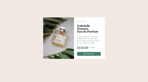
Submitted over 1 year agoA solution to the Product preview card component challenge
Responsive Product Preview Card Component
@Chirtoaca94

Solution retrospective
What are you most proud of, and what would you do differently next time?
I am most proud of working through the responsive layout problems, particularly around the image issues. Next time I will use the image as a background image for a container. This seems to be much easier for creating responsive layouts.
What challenges did you encounter, and how did you overcome them?Deploying to Git and then creating a live preview of the component online (which I eventually did via Vercel) Quick researches helped me to overcome these challenges.
What specific areas of your project would you like help with?Mainly around responsive best practices and pointing out bad practices that may cause issues down the line.
Code
Loading...
Please log in to post a comment
Log in with GitHubCommunity feedback
No feedback yet. Be the first to give feedback on Christian Chirtoaca's solution.
Join our Discord community
Join thousands of Frontend Mentor community members taking the challenges, sharing resources, helping each other, and chatting about all things front-end!
Join our Discord