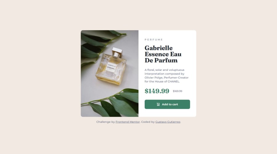
Not Found
Not Found
Not Found
Not Found
Not Found
Not Found
Not Found
Not Found
Not Found
Not Found
Not Found
Not Found
Not Found
Not Found
Not Found
Not Found
Not Found
Not Found
Not Found
Not Found

Submitted

Responsive Product Preview Card Component

P

@gustavo2023

Desktop design screenshot for the Product preview card component coding challenge

This is a solution for...

  • HTML
  • CSS
1newbie
View challenge

Design comparison


SolutionDesign

Solution retrospective


What are you most proud of, and what would you do differently next time?

Next time I would like to try to something similar but using a library like Bootstrap or Tailwind.

What challenges did you encounter, and how did you overcome them?

I had trouble changing the image source depending on the screen size. At first I tried using the srcset and size attribute of the element but I couldn't get it to work. Eventually with some Google searching I read about the element and how it is used and managed to solve the problem.

What specific areas of your project would you like help with?

Any feedback on the semantic HTML, like improvements in accessibility, or the use of media queries in my CSS would be appreciated, as well as any mistake I might have overlooked.

Community feedback

T
Grace 30,650

@grace-snow

Posted

Hi, I've got some suggested improvements, I hope these help.

  • when doing single component demos like this try to think about how they will be used when placed in a real site. You know this card would never be used to serve the main heading on a page, so you know it shouldn't have a h1. Use a lower importance heading level like h2 instead.
  • the old price needs to be wrapped in a strike through (s) tag.
  • people using a screen reader may not know that is an old presale price though. A good way to do that is adding a span with an sr-only (visually-hidden) class on it that says its the old price before or inside the strike through.
  • if using an inline svg for the decorative cart icon you need to add aria-hidden="true" focusable="false" so it's hidden from assistive technologies.
  • CSS looks good. You don't need to set border radius on child elements like this though. Place it on the component instead and use overflow hidden to crop out the overflowing child corners.
  • note it's not wrong but a little unusual to write line height in rem. Usually that's unitless like 1.5, I think because it's shorter.
  • the css could be shorter overall if you used grid instead of flex. Then all it needs is 2 columns of 1fr in the media query, no need for width on children or extra flex properties.
  • this is hitting the screen edges when I view on mobile. Make sure that can't happen by adding a little padding on the body (in px)
  • I wouldn't expect to see such large paddings in the button or to see it change in a media query. That could cause problems for users who enlarge text or translate the site.
  • you may not want to use rem for the padding on the text area of the card either. Check what happens when users change their browser font size. Content may be squished very narrow when that happens. Often inline padding isnt something you want to scale with the end users font size. Or if using rem you may want it to be inside a min() or clamp() function to stop it ever getting too big.

I'll add that you shouldn't be using Bootstrap while learning. It's a very bloated UI library that won't help you learn html, css or JS well. Tailwind is nothing like Bootstrap, it's a CSS utility class library not a UI library. It's just a way of writing CSS in the html. (And using that too early makes projects quite difficult to review TBH).

Marked as helpful

1

P

@gustavo2023

Posted

Hi, thanks for the valuable feedback. I have implemented all the suggested improvements.

I will keep in mind your suggestion of keeping real site context in mind. I wrapped the old price in a <s> tag and added a <span> to show screen readers the old price. It was my first time implementing a sr-only class, but I think it turned out well, of course any feedback on that is welcome.

I switched from Flexbox to CSS Grid for a cleaner and more maintainable layout and I also added some padding to the body to prevent the content from hitting the edges on mobile screens.

As for the padding on the text area of the card I ended up using % although I'm not sure if that is the best option.

I'll heed your advice and I won't be using Bootstrap or anything similar for now on this beginner projects. I agree that I should first stablish a solid foundation using regular HTML and CSS.

Thank you again for your insightful suggestions

0
Bunchydo 70

@Bunchydo

Posted

As a fellow beginner myself, I really like how the design turned out. I'm unable to help with the code review as I need help myself, but I just want to encourage you to keep pushing!! You are doing great!!

1

P

@gustavo2023

Posted

Hi @Bunchydo thanks for the encouragement! I appreciate it, I hope you can keep working hard as well and keep improving.

0

Please log in to post a comment

Log in with GitHub
Discord logo

Join our Discord community

Join thousands of Frontend Mentor community members taking the challenges, sharing resources, helping each other, and chatting about all things front-end!

Join our Discord